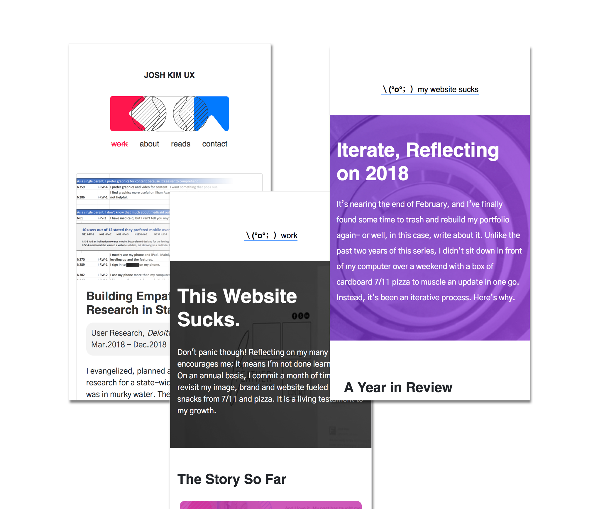
2018 in Review Iterate
I’ve finally found time to trash and rebuild my portfolio again- or well, in this case, write about it. Unlike the past two years, I didn’t sit down in front of my computer over a weekend with a box of pizza to muscle an update in one go. Instead, it’s been an iterative process.
A Year in Review
2018 was a big leap for me in design maturity. From the books I have studied, to the mentoring relationships I have fostered and through the work I have done - I’ve gradually become more comfortable in accepting that one doesn’t really “become” a designer at one point. Instead, we’re constantly in a state of learning because there really never is a “perfect” end state. It is endless iteration.
In the same way my perspective has changed, my portfolio has taken a similar path. I began making updates throughout the year instead of at a single point in time as I learned more and more about experience design.
Instead of fussing over the minute details, I took on a “doing” mindset after a failed project that taught me that “perfect” isn’t really perfect in design. (Creative Confidence, The Lean Startup, Conversations with Design Entrepreneurs).
Instead of focusing on just adding more content, I began to think about how I could better reduce and organize what currently existed. (Living in Information, How to Make Sense of Any Mess, About Face, The Life-Changing Manga of Tidying Up).
Instead of designing based on a form that matched personal preference, I sought feedback from recruiters and friends, switched on google analytics, and took a user-first approach to my portfolio. (The Lean Startup, Designing with the Mind in Mind, About Face, Designing Products for the Digital Age).
Instead of settling with the status quo, I made my portfolio more personal and honest than ever to inspire myself to design for good.
Reduce
My old portfolio used up a lot of space. Like, a lot. From the billions of hr tags I littered all over the place to the massive “Continue Reading” buttons that threw off the balance and fought for attention on my work page- there was a lot of room (ironically) for improvement.
I consciously began to reduce all sorts of content on my portfolio by not only visually off-loading the obvious elements, but by also vectorizing my efforts on what was important to you (my user) and what wasn’t. There’s still a lot of work to be done, but it looks a hell of a lot better now.
Get Feedback
I didn’t do a discovery phase when I first made this version of my portfolio. It was a deliberate tradeoff for speed given the limited time I had. That of course comes with the consequence of designing with bias and sloppy code. Despite being aware of this, it wasn’t really until after I read “The Lean Startup” by Eric Ries in early March that I thought of collecting more granular feedback.
To start, I slapped on google analytics to all of my pages. I kept most of my analysis pretty light, observing common happy paths through behavior flows and engagement. In the beginning, things looked pretty bad. People didn’t really stay long on many of my pages- most notably “About.”
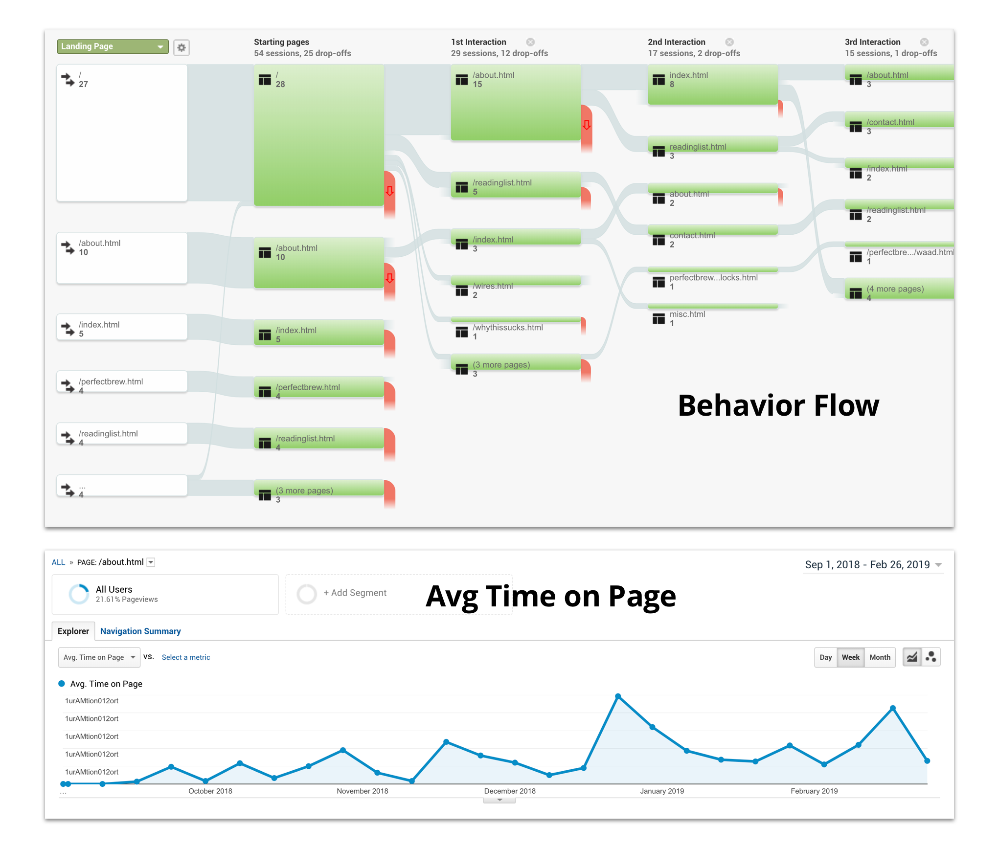
Instead of re-designing immediately for better engagement on a personal hunch, I scheduled some lunches to talk to recruiters, friends and acquaintances (a la Eric Ries’s Build-Measure-Learn loop). Some recruiters didn’t want to look at a wall of text. They wanted to be able to find the important bits quickly. Others wanted more granular information to get a good understanding of my personality. My friends thought the pages just looked flat out ugly.
I took the feedback and began making changes. Although I wasn’t able to get it right from the very beginning due to time limitations, I’ve still been able to make sizeable changes through a series of small feedback loops throughout the year.
Inspire
I keep learning more about myself as my career progresses. 2018 was a milestone for me in this regard. My work transformed into a calling after I realized the greater responsibility it entailed while staffed on a state health care project. Since then, I’ve only become more passionate and motivated to design better products for the purpose of good.
So what does this all mean in this context? Well, for starters- this is no longer just a portfolio to get me the next job. It’s also become a living diary of the work that I have done and a framework for the person that I aspire to be. I want to unite the work that I do to the greater goals that I have as an individual as they become one and the same. In this way, I can hold myself accountable to the products I create and the people whom I serve.
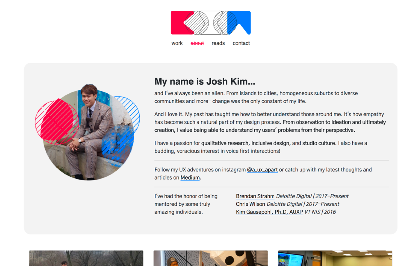
I’ve changed the voice of this portfolio to be more personal at the expense of coming off as a flawless professional. I want to be publicly upfront about my failures so I can inspire myself to do better and so that you can be more aware of my story and what drives me. I want the kids that I mentor to see my disappointments front and center next to my achievements so that they know that becoming a designer isn’t a secret, impenetrable profession that only comes out of art school and perfection (for more, read about Koi Vinh’s thoughts on the democratization of design).
I fail a lot. It’s something I’ve always embraced privately because it has gotten me to where I am today. In 2019 I will commit myself to continue being honest with myself and to you in order to further inspire and internalize my calling as a designer for good.
Upcoming Fixes
Yea so, this website still sucks. There's still so much more to work on. Here's two of the major ones I'm still planning of fixing... but haven't quite had the time yet to address.
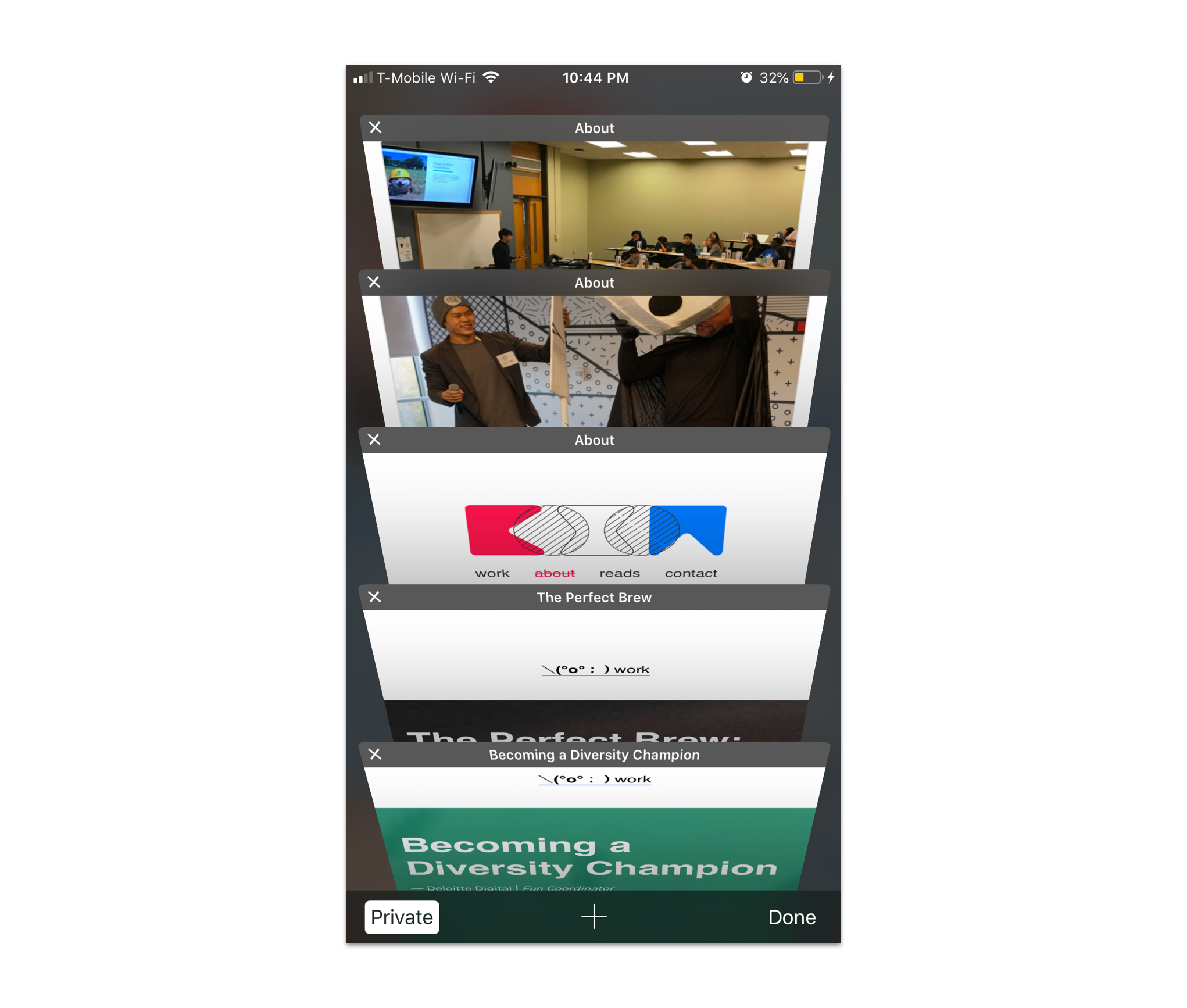
New tabs kinda suck on mobile.
My current portfolio's audience usage is a split between 60% desktop and 40% mobile. I originally had set up my hyperlinks to open up a new tab to support desktop primarily, until my UX partner Zoey brought this frustrating item to my attention. This sucks too much not to fix for the 40% of people who use mobile. My hunch is to create a new global navigation that makes it easier to get around my website. That way, even if the user is redirected to a new page they can find their way back relatively easily instead of having to (or forced to) open up tons of tabs.