2017 in Review Identity
This is my 2017 in review. The theme and reason for this change is what I will be referring to as “The Great Identity Crisis.
1. Choosing an Identity
In 2017, I released what would be the third major version of Feather Design. For the past half decade I operated under this business name, but with time I found it harder to maintain a clear personal brand. The more I studied design, the more I came to the realization the importance of presenting a core narrative. My website was a contradiction of that. To get some more context on the change, read my article on how I rebranded my logo.
I am a UX Designer. I am not a graphic designer. I am not a web developer. Can I do work in both? Yes, but that’s not the root message I want to communicate. My passion and cumulation of studies led me to embrace this identity, so my website should do the same. Before I began building a new portfolio, I made it a priority to definitively state what I was in clear terms. This would guide the rest of the process which included removing “Feather Design” from my brand and focusing more on myself as a UX designer.
2. Experience First
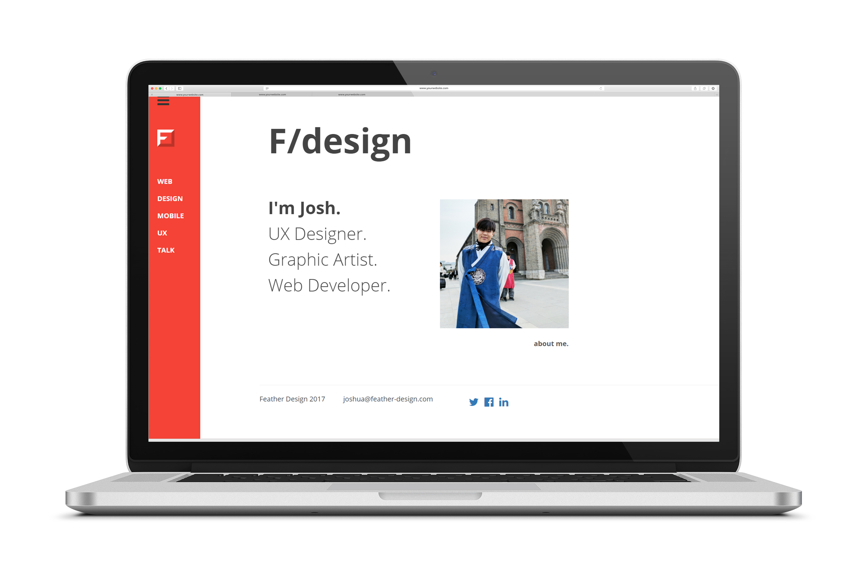
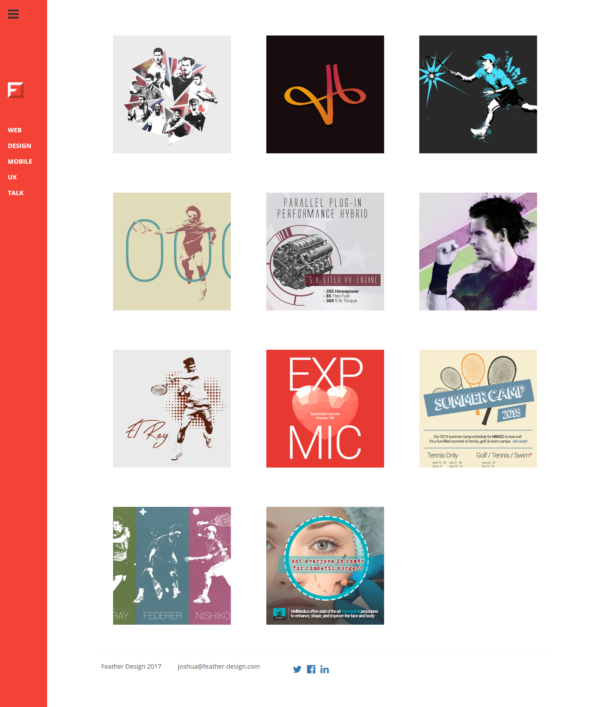
In Feather Design 3.0, I wanted to show I was capable of doing front-end web development so I spent hours figuring out how to build my website rather than focusing on the content and experience. As a result, bad experiences were everywhere. This was a direct consequence of not defining and narrowing down on my brand's priorities and goals.
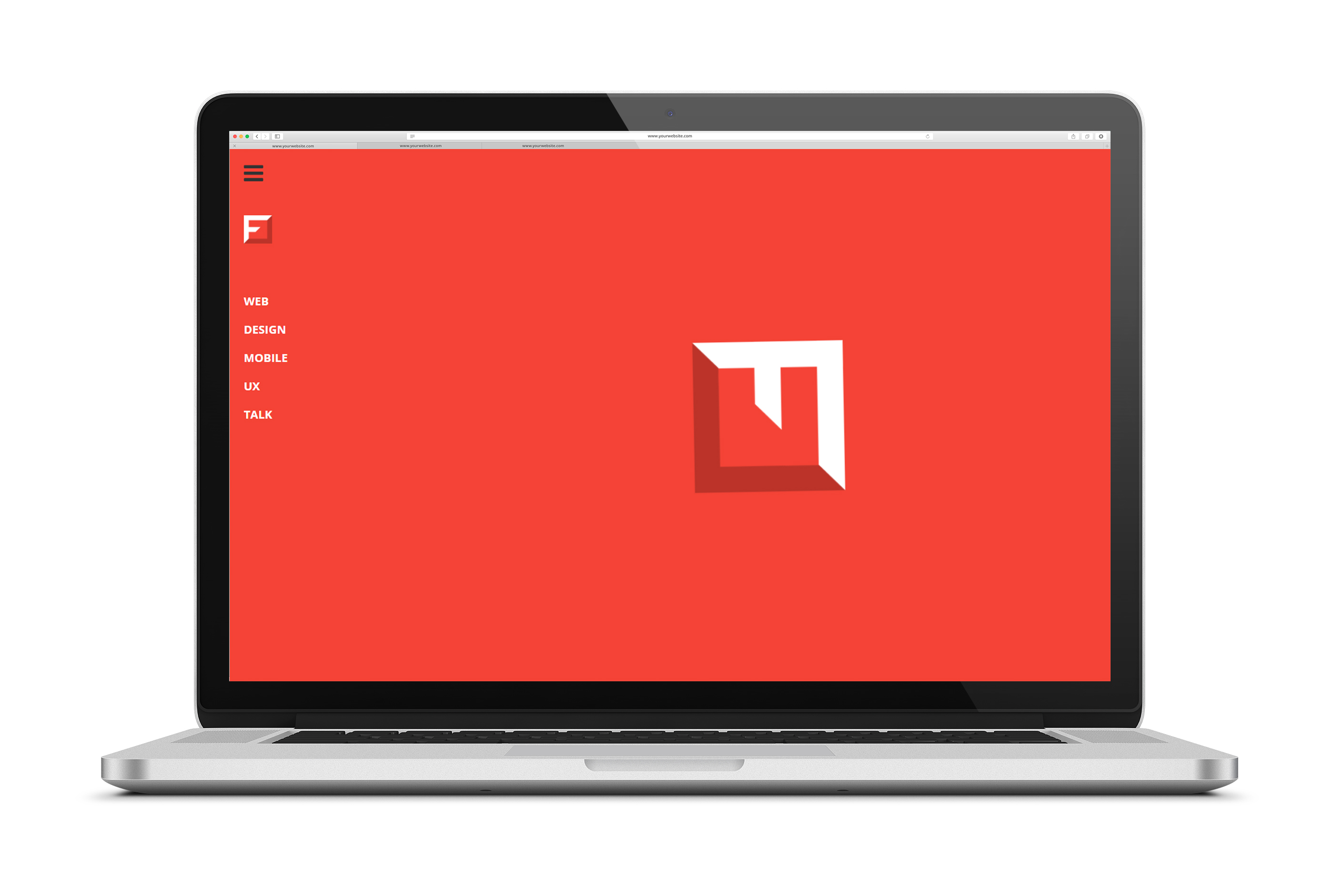
You can view the mess Feather Design 3.0 was here.
2.1 Slow Architecture
The entire website was built on a singular page using pseudo-static content architecture. I built a method of showing portfolio items through animated boxes using greensock.io and jQuery functions. Through function calls and an in-house div tagging system, I could hide and show relevant portfolio items based on sidebar clicks. To add a finishing touch, I added a load screen which would wait until all elements were ready before revealing the page. As a result, endless load times with no user feedback often occurred during connection loss. Furthermore, the time to load the website could extend upwards of 7 seconds- barely at the limit of a user's patience.
To amend this, I focused on providing a good experience first in my new iteration of my website. I removed excessive flashy animations, and separated portfolio items into their own individual pages.
2.2 Mobile Compatibility
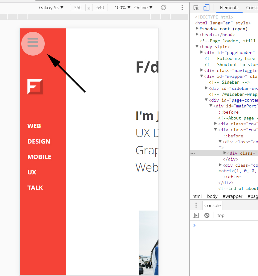
Using bootstrap as a base does not guarantee a mobile-friendly result. I designed my old website’s navigation using a hamburger on the far top-left of the screen. On mobile, this would be a terrible physical interaction experience as the user would be unable to reach the navigation using their thumbs. Furthermore, when the navigation expanded, the hamburger would have to be pressed again to close it. No interaction affordances or cognitive clues were given to indicate this.
The current site you are using right now does not use a hidden navigation. I split the possible user routes between three of the most common portfolio use cases- viewing my work, learning more about me, and contacting me. On mobile, the use of words as affordances on buttons rather than a hamburger icon makes communication more direct and understandable.
2.3 Information Overload
At a UX portfolio workshop I attended at Deloitte Digital, one of the key lessons that stood out to me was the emphasis on keeping things simple and focused. The best portfolios I’ve observed are able to walk a user thoroughly through a select amount of projects. This was a stark contrast to my old website where I focused on quantity over quality to show my experience over a broad spectrum of topics.
Since then, I’ve become much more acquainted with the UX work domain and have made it a priority of mine to focus on the quality of the process rather than the quantity of results. I have reduced the amount of projects actively shown on my home page, and have given items I find more important more emphasis using the Z-pattern and gestalt principles.
3. Conclusions
I am a UX designer. Confirming and moving forwards with that statement has allowed me to create a new website that better represents my brand. It's common sense, but having a theme to follow makes decisions simpler and ideas more clear. That being said, I am sure I will continue to change and grow in my professional career. I'm looking forward to tearing this down again in 2019 :)