2019 in Review Include
2019 popped my bubble of naive realism and projection bias. As a result, I’ve found new values as a designer. I want to create more meaningful and inclusive products.
In this annual update, I’ll be sharing what I learned this year along with how I’ve updated my portfolio to reflect my new values.
A Year in Review
I’ve learned through my studies that good design must be meaningful for the people we design for. It must be deliberate. However, it is critical to note that its success significantly depends on our definition of “people.” We can’t succeed if we trust our own intuition as a proxy for universal truth.
That being said said, I have realized two things this year:
- So much junk gets DIY’d together and thrown into the world under the guise of design because we incorrectly believe we are able to interpret the world around us objectively (naive realism).
- I was and still am a part of that problem as a human who naturally believes that others have similar priorities, attitudes, or beliefs as myself (projection bias).
Naive realism and projection bias often result in products that are sexist, racist, inaccessible, or even dangerous. This means alot to me as someone who often works on federal and state projects that generally aim to be inclusive for all people. I have been reminded of the dangers of simplifying design challenges by trusting one's own expertise (which is ignorance or arrogance) as a substitute to proper research.
Human Perspective is Limited
Take a second and think of the word “people.” Who comes to mind? We can be more specific too. Take a second and think of “Korean people.” I’ll think of family and close friends. Others might think of BTS or Kim Jong Un.
Depending on who you are, where you grew up, and a number of other factors- your lived experiences will shape how you interpret and see the world as a result of pattern recognition.
That being said, our perspectives are really biased. The bad part is, most of us don’t like owning up to that- especially if it disenfranchises other people, makes us feel like we’re a part of the problem, or becomes a barrier to quickly completing our work.
I’ll use myself as an example. As a minority, military kid I grew up in both rich and poor neighborhoods. I attended both the church and the mosque. I politically leaned left and right. I even went to one of the most diverse high schools in America. For a moment I thought I was pretty woke as a designer. If anyone could be empathetic on the job, it would be me...

...But that's precisely the kind of arrogance/ignorance that can trap designers (like myself) into thinking "hey, it's ok for me to cut some corners during research- I get it!" No matter of how culturally woke anyone may claim to be, it is still impossible to act as a proxy or 'expert' for all people. Let me explain using myself as an example.
- I’m not a woman. 50% of the people I design for encounter problems I will literally never have to experience. Not having to think about rape threats on Twitter, not having to think about someone stalking me by finding my personal information online, not having to fight against belittling expectations and outdated gender stereotypes, etc. All of these things- and more- can influence how we design products. I can’t take any of those into account unless, at the very least, I balance out my sample size to be representative of the true population (could be debated to sample more women to fight existing imbalances perpetuated in the tech industry).
- I’m not a truly underprivileged minority. As an East Asian male, I am probably the second most privileged group in the United States after white men. I even have the choice to use a super generic white name "Josh" instead of “Young Soon” (my Korean name which could prompt recruiters to check if I’m a native US citizen). At first glance, no one assumes I am uneducated or a threat worth tasing.
- I don’t have a physical or cognitive disability. I’ve never had to use a screenreader. I have two hands to type and move a mouse with. I don’t get migraines from reading small fonts at high contrast and I can tell an error and success state apart by color alone.
To even assume I can design for any of the people I’ve listed above without a well-thought sampling strategy is both arrogant and dangerous. To claim that I can represent other minorities is also grossly false because I benefit off of their lack of privilege.
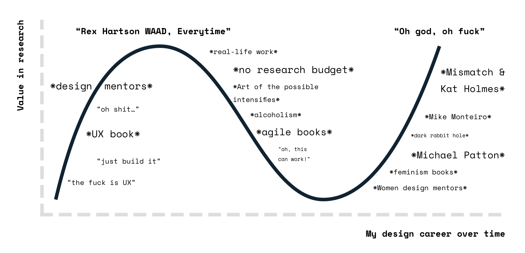
However, all of this wasn't 20/20 until I took on a series of feminist reads during the summer of 2019. Before that moment, I had begun falling into the trap most other jaded designers get stuck in: justifying shortcuts in research through weak excuses such as ample ‘real-world’ experience, best practice* know-how, and business constraints.
*If you have the term "best practice" in your vocabulary, please reevaluate that term. If you're a designer you should know that "best" can never exist. Use "effective" instead.
What We Can Do
Some action-items for any designer reading this, or if you’re interested in forwarding this to someone else who needs a friendly slap of reality.
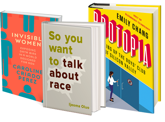
- Men, get educated. All designers should be feminists. If you’re not, there’s a huge gap of knowledge that needs to get filled in. Read Invisible Women, Moment of Lift, Technically Wrong, Brotopia… or just hire more woman onto your team (and listen to them).
- Learn how to do research, it’s your job. Sample the right people. If your level of research knowledge stopped at General Assembly 101, you need to read a proper textbook. If you think you can shortcut the research process, check out Invisible Women or Ruined by Design to convince you to read a proper textbook (so you don’t create products that kill or exclude people). Just Enough Research is a good starting point. When you’re ready, Qualitative Research Methods and Evaluation by Michael Patton is invaluable.
- Rally behind diversity and inclusion at work. The best and probably only good way to design inclusive products is to have an inclusive company and a diverse team working on it. Diversity is a strength. If you only have white men designing a product, you’ll create
exclusive experiences that enable rape cultureTwitter. Accessibility is best when it’s accounted for in early conversations- there’s no better representative for those conversations than a designer with a disability fighting for accessibility research and testing from kickoff. Encourage your employer to hire more women minorities, be vocal about diversity as a key requirement during your job search, give credit where it’s due, and create safe spaces for those less privileged to take lead.
Godspeed.
Portfolio Updates
The theme of 2019’s reflection is Include which represents my new values as a designer. To put this into better practice, I followed two tenets as I made updates to my portfolio:
- Improve accessibility.
- Plain and simple before unique and complex.
Improve Accessibility
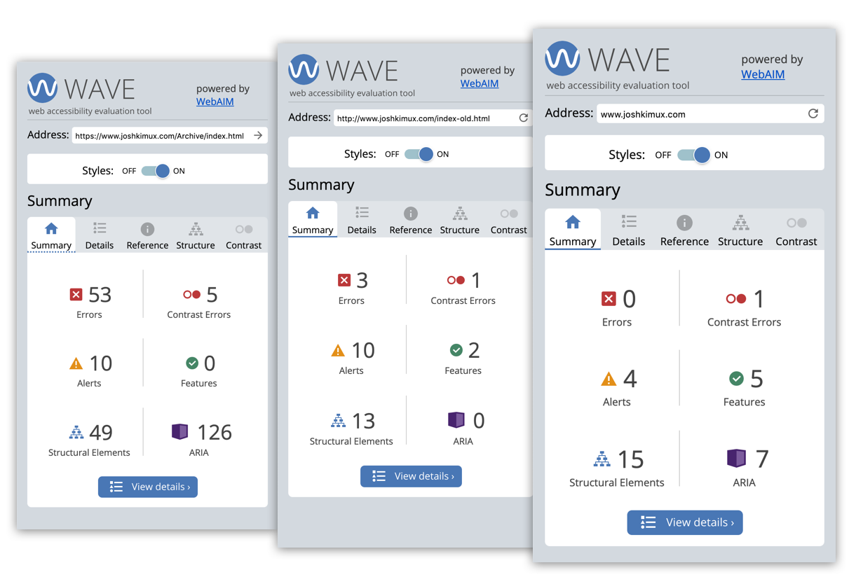
My website scored terribly on my first shot when I ran it through WAVE. After even several iterations of updates, I still had problems with structural hierarchy, alt-text, and more.
Many of these problems were a result of not following native HTML semantics. When I first put my portfolio together, I had a student engineer’s mindset of brute forcing solutions. To fix this, I had to spend a considerable amount of time redoing the HTML of my portfolio:
- Reset styling of headings back to their defaults and strictly outlined each page before inserting content. This fixed skipping of heading levels and reduced redundant links.
- Added alt-text to all images on my main pages- this is still an improvement area I need to do alot of work in as they remain to be redundant or poorly written.
- Reduced the amount of custom components in favor of native HTML elements.
There were also issues that the WAVE checker did not catch that I worked to improve including:
- Gave more context for redirects on href links by making them longer phrases rather than individual words.
- Increased font and line height for all content.
- Designed full reflow capability to accommodate 200x magnification and browsing on smaller screens.
- Removed red and blue underlines that distinguished selected states in the navigation.
I am currently working on the following:
- Reducing the size of images by converting .pngs to .jpgs.
- Improving alt-text to be more descriptive and less repetitive.
- Converting accordions on the index and about me page to tabs.
- Testing my website with more people with disabilities.
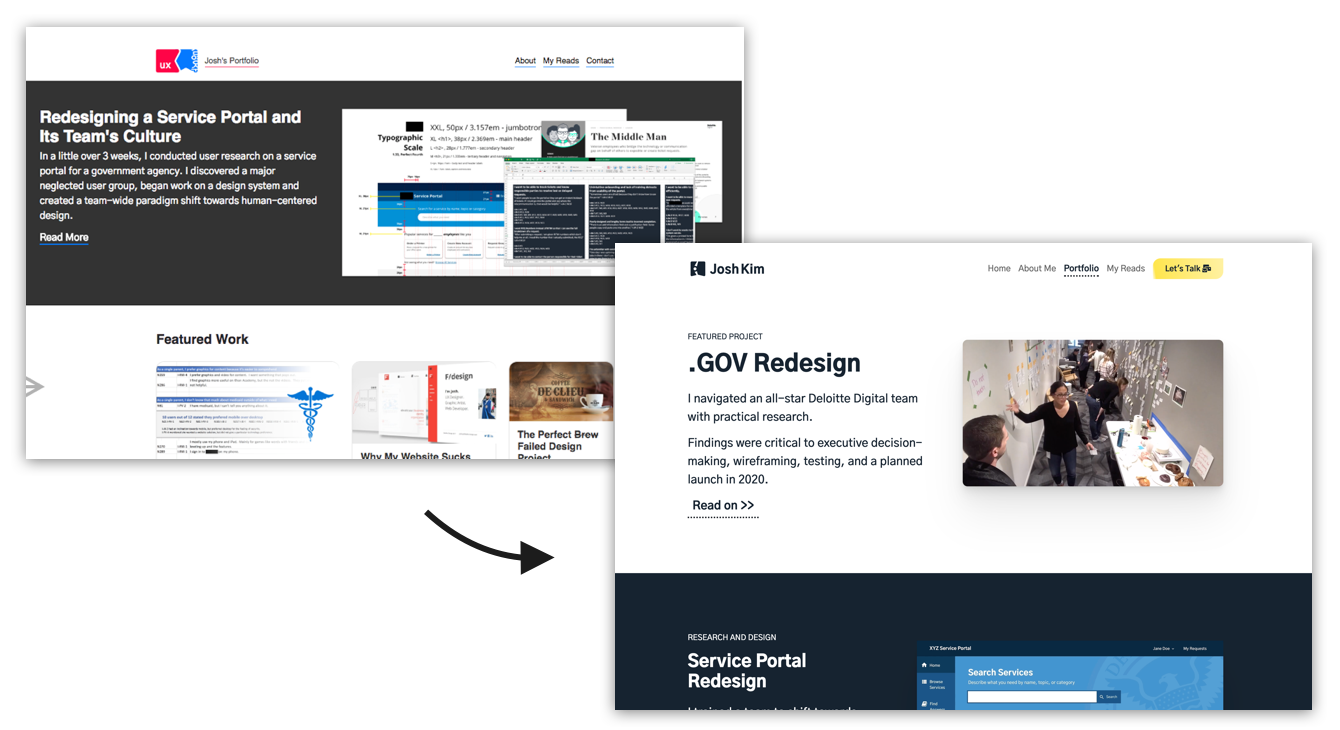
Plain and Simple
I’ve always had a stupid inclination to want a unique, eye-catching, and trendy website that could stand out from a crowd while stuffing as much of my brain into it as possible. The problem is, those websites usually are the opposite of usable and accessible design.
It took me more than 5 years to address this face to face by following this tenet. Thank god for that. Here’s what I worked on:
- Added clear call-to-actions (CTA) and nudges. Set rules for usage on buttons and stuck with them to avoid mixing semantics.
- Significantly increased padding between sections which makes content significantly easier to scan and digest. Set a new rule to feature one piece of information at any point while scrolling. This kept me on my toes in terms of information hierarchy and decluttered what used to be a newspaper-looking interface.
- Reduced all written content throughout the website, broke text blocks into more paragraphs, and increased spacing between titles.
- Added article outlines for longer portfolio pieces and shortened executive summaries.
- Simplified images and rounded edges for a more consistent experience. Removed stacked or visually complicated images.
- Selected a few colors, labelled them, and consistently applied them universally. The yellow accent color is used in less than 5% of the website so its importance won't degrade.
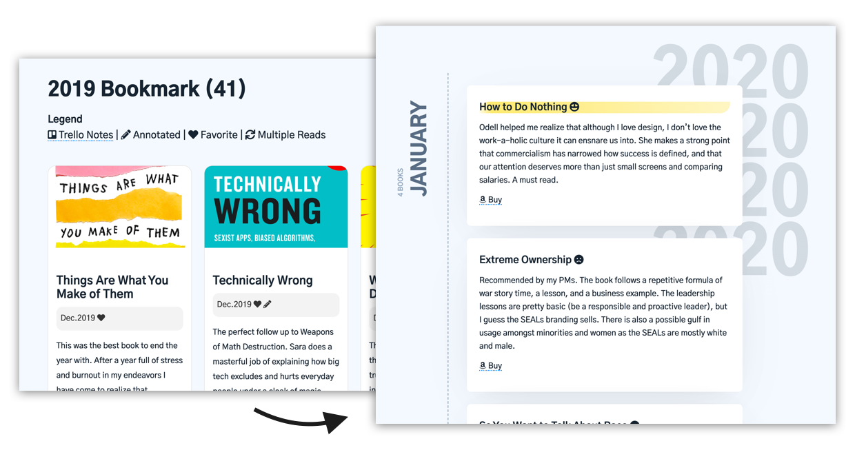
- Removed all pictures and unnecessary metadata from the My Reads page. Converted 5 scale rating system to a smiley system and highlighted favorite reads. After simplifying the structure and content, I made the UI more unique within the boundaries of my new style guide. All headings remain semantically labeled and the UI is designed for reflow.
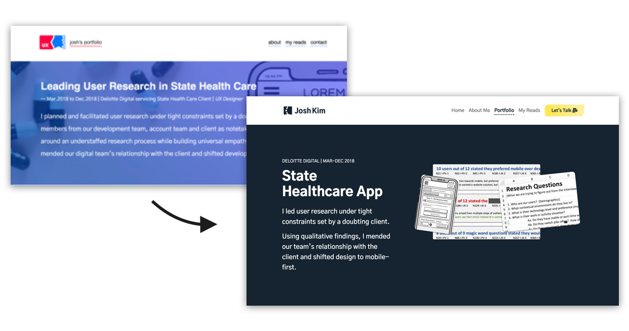
- Removed gradient and picture background banners from all important articles in favor of a solid dark fill and image. This transitions much smoother to mobile and is significantly easier to read.
New Logo
Let me start by saying I'm not a visual designer, nor do I have any plans to act as one. Alright. Moving on.
I always knew I had to redesign a new logo the moment I made my old one. The lack of context (no name), undesirable complexity, and sharp color choices made it a poor representation of my brand.
For that reason, I set strict constraints before starting a new design:
- My name must be included.
- A maximum of three elements will be present.
- Must be square for universal usage and interpretable at 16x16 pixels.
- Represents my tenets of accessibility and simplicity.
- Must use only one color.
The new logo reinterprets pieces of my old design. I’ve retained the background shape that represents “M” with friendly rounded corners. At the center is a bird’s eye view of the A11Y human logo for my commitment towards accessibility. The arms and head cut out the shape of a K in the shape and the head and arm combine to form a lower case i. Together the logo spells out my last name similar to previous iterations, but still manages to encapsulate my tenet of simplicity. At the size of a favicon, it remains interpretable.
Books and References
For more on my new values as a designer, you can read a Medium article I wrote documenting the 7 key things I learned from 41 design books in 2019.