Deloitte Digital Rescuing a service portal through lean research
I saved an agency millions of dollars by maturing their product strategy using human centered methods, content design, and evangelism.
Challenge
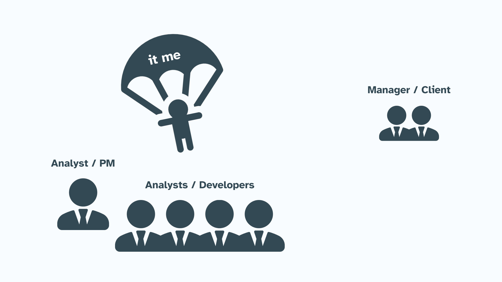
As a design consultant within the government space, I sometimes experience what Dr. Hartson calls a “priest in a parachute” assignment.
In the early days of usability it was often assumed that a usability practitioner was needed only in small doses and only at certain crossroads within the project… they played a secondary role, something like a ‘priest in a parachute’: the human factors engineer dropped down into the middle of a project and stayed just long enough to give it a blessing.
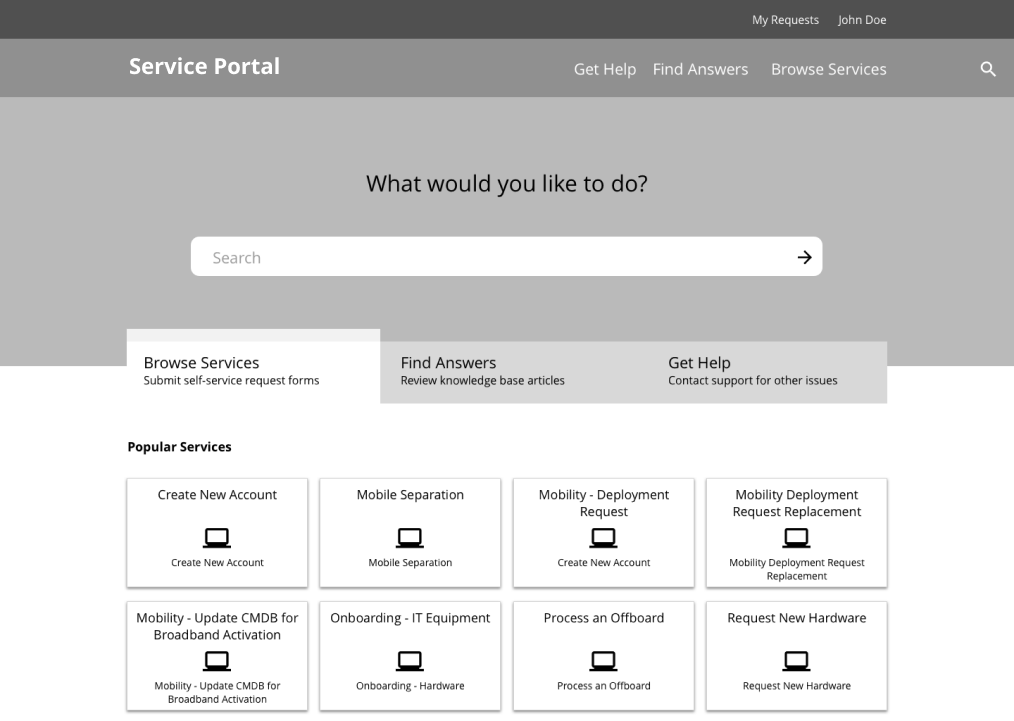
In this instance, I was assigned to inform minor UI design changes to an agency's service portal. I realized that the goals of this initiative were driven by stakeholder priorities to visually facelift the interface instead of centering real user needs.
In other words, I was brought in to give "blessings" towards a project already in flight.
An analyst team
To make things more complex, the project team developing the portal were analysts who believed UX design (beyond UI tweaks) was a subjective and unnecessary step.
Setting goals
Despite being a priest in a parachute, I gave myself two goals:
- Meet the client's expectations by providing a list of prioritized UI recommendations.
- Shift the focus from stakeholder-led priorities (UI design fixes) towards user-centered ones using user research.
Week 1 Heuristic Evaluation
After an initial kick off meeting and several conversations with the client and my team members, I started with a heuristic evaluation to:
- Better understand the product ahead of user research.
- Complete my contractual duty of a list of prioritized UI recommendations.
- Establish team member trust in my competence within a short time frame.
- Softly ease my team members into the language of design through the use of UI Tenets and Traps (I find it's associated brand recognition, tactile cards, and plain language easy to share).
By the end of the first week, I gave a presentation on my findings. By meeting the client's needs early, I was able to win buy in for conducting user interviews to "validate" my findings (ya boi was actually plotting sweet generative research).
Week 2 Conducting lean UX research
Through my stakeholder interviews, I learned that there were two primary user groups of the portal:
- Requestors who are looking to request a service
- Approvers who approve those requests
Given the limited timeframe, I took a lean research approach to unravel just enough insights to reframe the focus of the project.
Specifically I:
- Used a snowball sampling strategy starting from a small list of names from my client to reduce time spent on recruitment and create flexibility to pivot if any unknown user groups emerged.
- Planned for onsite interviews to collect rich data from their contextual surroundings.
- Prepared back up methods (task-based usability testing and closed card sorting) to enable my sessions to be adaptable (should any method fail) and better triangulate my work.
I also asked one of the analysts who was serving as a product manager to join me as a notetaker. I specifically reached out to him as his buy in would be invaluable for the future of the work.
Our first session together was a success. The PM analyst learned to trust research as a key step after he listened to our users.
With his support, we convinced the other analysts to join us in future sessions. And, by the end of our interviews, all of my team members were beginning to speak in the voice of the user.
Closed card sorting
Preparing additional methods was also a successful bet.
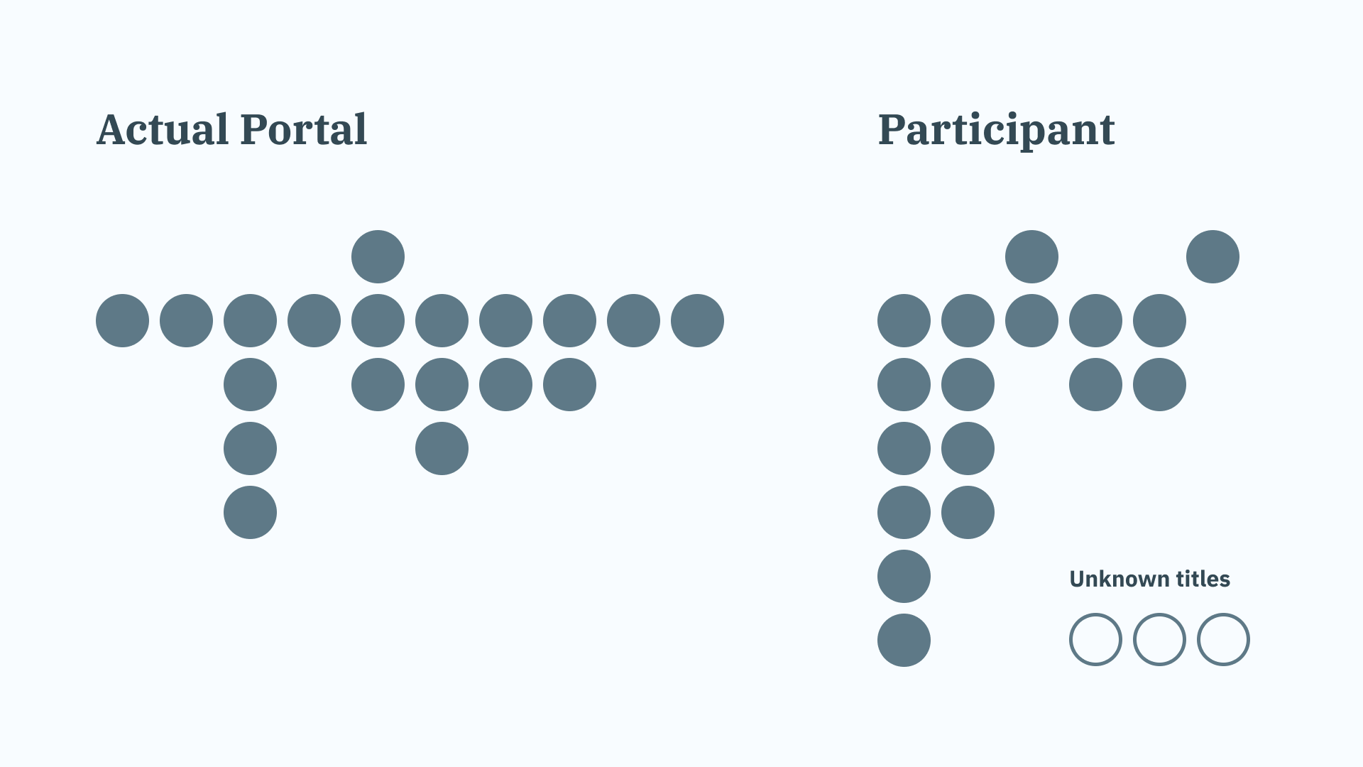
For interviews where our team had extra time to work with the participant, I conducted closed card sorts to gauge their familiarity with the portal and to better understand their mental models.
I asked participants to organize a deck of notecards with page titles from the portal into a hierarchy that was most intuitive to them. From the limited amount of findings, I discovered that even power users struggled to recreate the original information architecture beyond a 20% accuracy.
These quantitative findings and physical artifacts would pay dividends in my reporting later on.
A hidden population
Halfway into the second week, I had an “aha” moment that we were only covering a small piece of the puzzle.
Our client had selected the initial interviewees based off of their frequency of use of the portal, and as a result, we ended up talking mostly to liaisons who would submit requests on behalf of other employees.
Because the team had always relied on quantitative data on usage of the portal to identify who their end users were before, they had missed an entire population of users who abandoned using the portal due to its poor usability.
I noticed this in our qualitative research because the liaisons often observed that many employees would opt to call the helpdesk instead of submitting their own tickets. Our snowball sampling confirmed this when we interviewed our first non-liasion employee.
Although it was satisfying my hypothesis snowball sampling could unveil an unknown population was validated, I was already running out of time by the end of the second week and was politely asked by the client to wrap up our work by the end of the third.
Area for improvement: Had I known we had access to quantitative data earlier on portal usage, I would have sampled the interviews by extreme outliers. This would have netted the beginner users who quit the portal early into interviewing as opposed to later.
Week 3 Analysis and reporting
Contextual Analysis
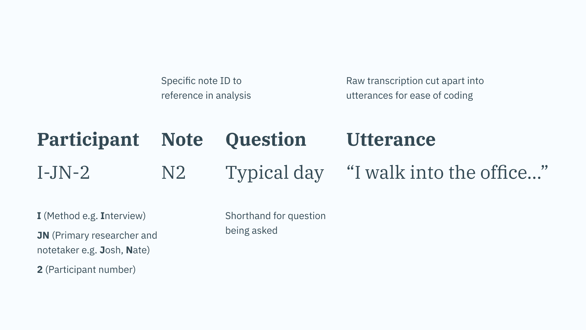
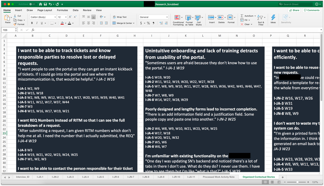
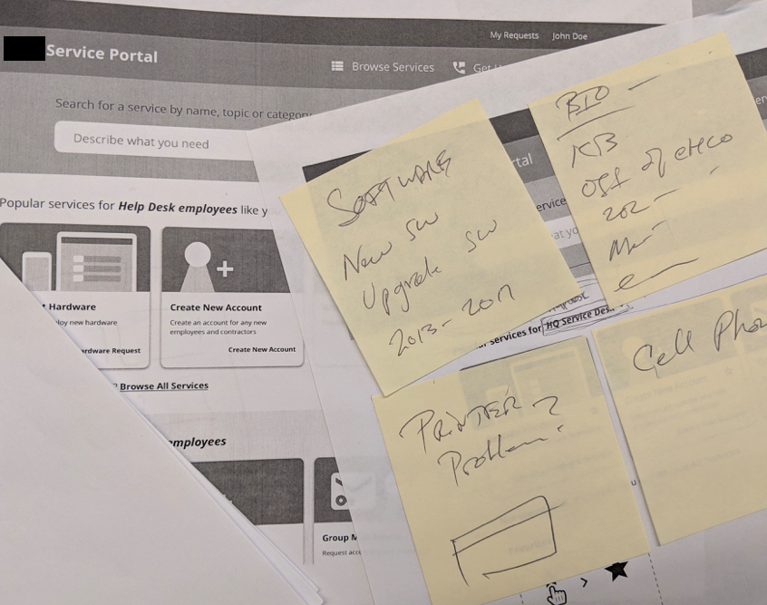
I opted to use a digital WAAD (work activity affinity diagram) adapted from Lextant which I have used several times in the past during time-crunch situations.
In an excel document, I converted the raw notes transcribed by our development team into work activity notes (WANs). I then started coding the work activity notes by key terms, topics, and behaviors on a separate column.
Upon completion, I used this column to infer contextual stories and provisional personas. These would directly inform the findings highlighted in my report.
Key insights
I spotlighted three high level findings to my client, each with their own sub-groups of issues and salient quotes:
- Users want to be able to track tickets and know responsible parties to resolve lost or delayed requests.
- Unintuitive onboarding and poorly designed forms detract from the usability of the portal.
- Users want to be able to complete tasks quicker and more efficiently, but are limited by system constraints.
I would like to have more control, I really feel out of control with this process. I keep being told that if I want to get something done faster just call the help desk. It's a very disturbing subject.
I wasn't even aware that you had to go to the portal to take names out or add in names. I called the help desk and they explained to me how to use the portal.
My biggest gripe is they administration just comes out with systems. They don't talk to people and end users to see how they feel about the system. With this maybe they just missed us.
Provisional personas
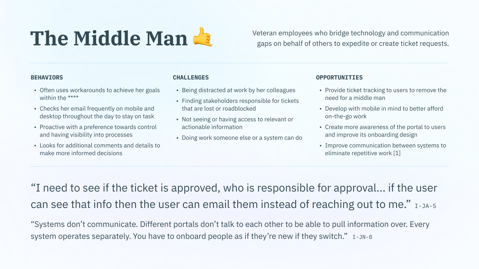
To make it easier for my client to visualize and understand his users, I also created provisional personas:
- the Middle Man (liaisons)
- the Specialist (highly technical approvers)
- the Uninformed (your day to day employee)
They were provisional to clearly communicate to the client that there were not enough interviews to fully uncover the width and depth of user frustrations and goals.
By stressing the major discovery of the "Uninformed" provisional persona in just one week, I reasoned that with more research, we could discover and address even more unknown issues that could save the agency millions in training costs and unsatisfied users.
Recommendations and immediate tasks
Finally, I packaged up a list of recommendations and immediate tasks for my client to take action on including, but not limited to:
- Conduct more open-ended research. I stressed there were different behaviors associated with the usage of the portal amongst submitters-- most notably between the Middle Man (routine usage) and the Uninformed (uncommon, needs-based usage). I made it clear that due to our original research scope and late discovery of the Uninformed, we were likely missing a significant amount of issues.
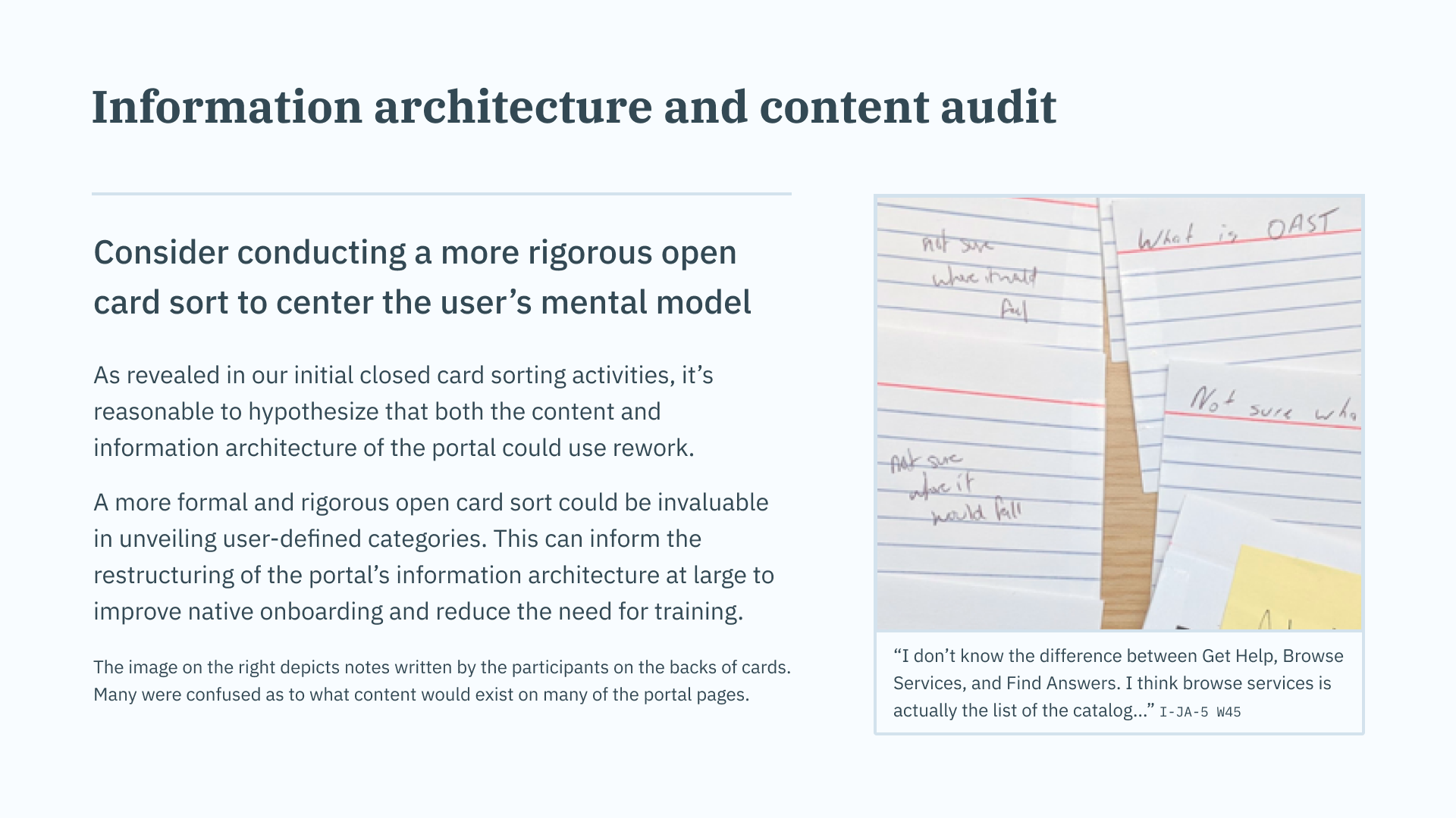
- Improve the content and information architecture of the portal. I was able to present my client artifacts and quantitative data from my appended card sorts. He was shocked to see that even expert users struggled to make sense of the portal's navigation and page titles.
- Establish a style guide. Both the heuristic evaluation and usability tests unveiled that the in consistency of components was creating a reoccuring issue for users. I recommended him to start by defining a set of design principles and conducting an atomic UI inventory analysis.
- Create user feedback mechanisms. I stressed these issues may have gone undetected as users who wanted to report problems had no formal methods of doing so.
- Add ticket tracking. The most commonly cited complaint during user research was the inability to efficiently track submitted tickets. This caused confusion when tracking individuals responsible for delays, frustration from lost or forgotten tickets, and an overall lack of control.
Week 4 Prototyping content improvements
The report was successful in winning myself a small extension for research and shifting the project's plans entirely. Instead of chasing minor UI tweaks, the team was now looking to hire their first full-time UX designer to tackle the larger recommendations in my report.
In our last week, I worked with my PM analyst to immediately schedule interviews with new hires and infrequent users on the portal. We hoped that by targeting these groups, we could better flesh out our "Uninformed" provisional persona.
I also planned to append contextual interviews with experimental prototypes to begin testing some content design hypotheses for the homepage of the portal.
Preparing for in-situ prototyping
To add on to our interviews, I took inspiration from John Whalen’s book “Design for How People Think, where he recommends presenting several versions of a prototype during early tests. This way, users can articulate which parts of a prototype they like and dislike. It can also reveal further unmet needs or nuances.
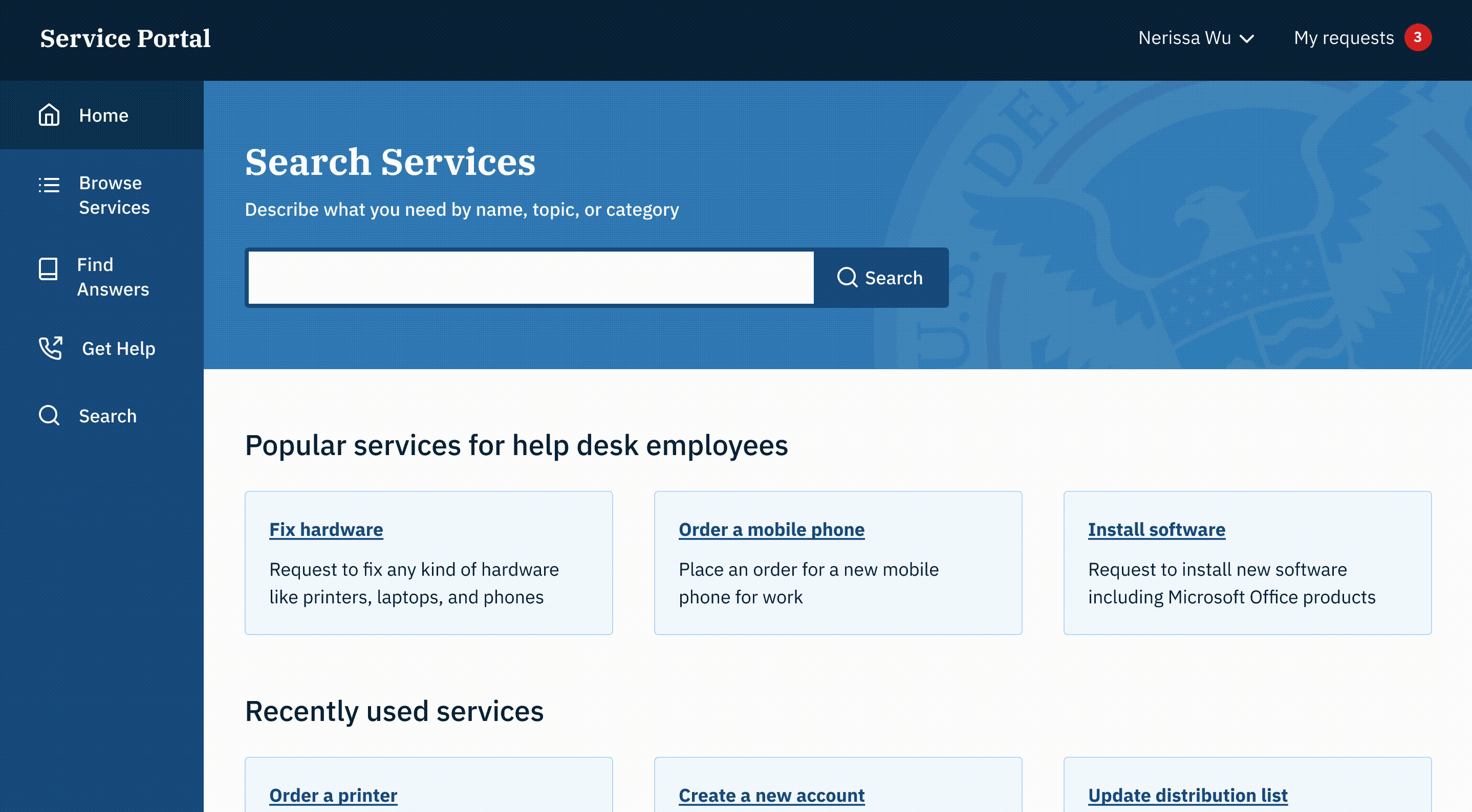
I created three greyscale prototypes: the original portal design, a portal that the client liked (which was “pretty” but not necessarily functional), and a portal that was designed based off of findings in our initial research on content and IA.
In my first pass at the research-informed design, I reduced technical jargon, removed unnecessary or repetitive design elements, and added clearer labels.
Early findings
In the first couple of contextual interviews, we learned that users were still struggling to understand the language of the portal and how to navigate from the homepage.
In all versions of the prototypes, including my redesign, the content remained to be a barrier-- it still wasn't in the user's language.
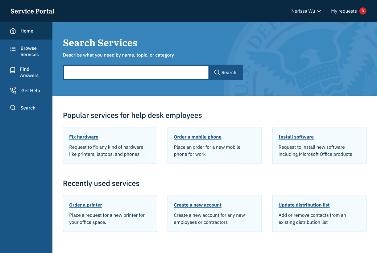
It seems obvious in hindsight, but “ordering hardware” is not as clear as “order a mobile phone.”
By the end of the week, I made further improvements to the prototype based on 4 additional contextual interviews of beginner users. I packaged these up into a Zeplin document which I passed on to the development team for future reference.
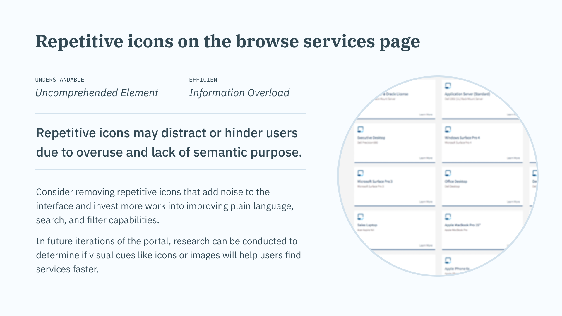
- I removed the icons from all of the cards and focused on improving content and categorization. This would allow the team to focus on the content first, and prioritize understanding the user's language.
- I recommended introducing “recently used services” to anticipate the needs of more advanced users without the extra clicks.
- I introduced “popular services for employees like you” due to mismatched expectations between services used most by all employees vs. services used by specific types of employees.
Parting gifts and conclusion
Although my time on the project had come to an end, I wanted to keep the team on track for its transition from stakeholder-driven decision-making to human-centered prioritization. Before officially leaving, I arranged some parting gifts.
- I provided a user interview crash course to the PM analyst and handed him a copy of Steve Portigal’s “Interviewing Users.”
- I conducted an atomic UI inventory audit to create a basic style guide for the development team to reduce redundant elements, begin to standardize their work, and provide a launchpad for their new UX designer.
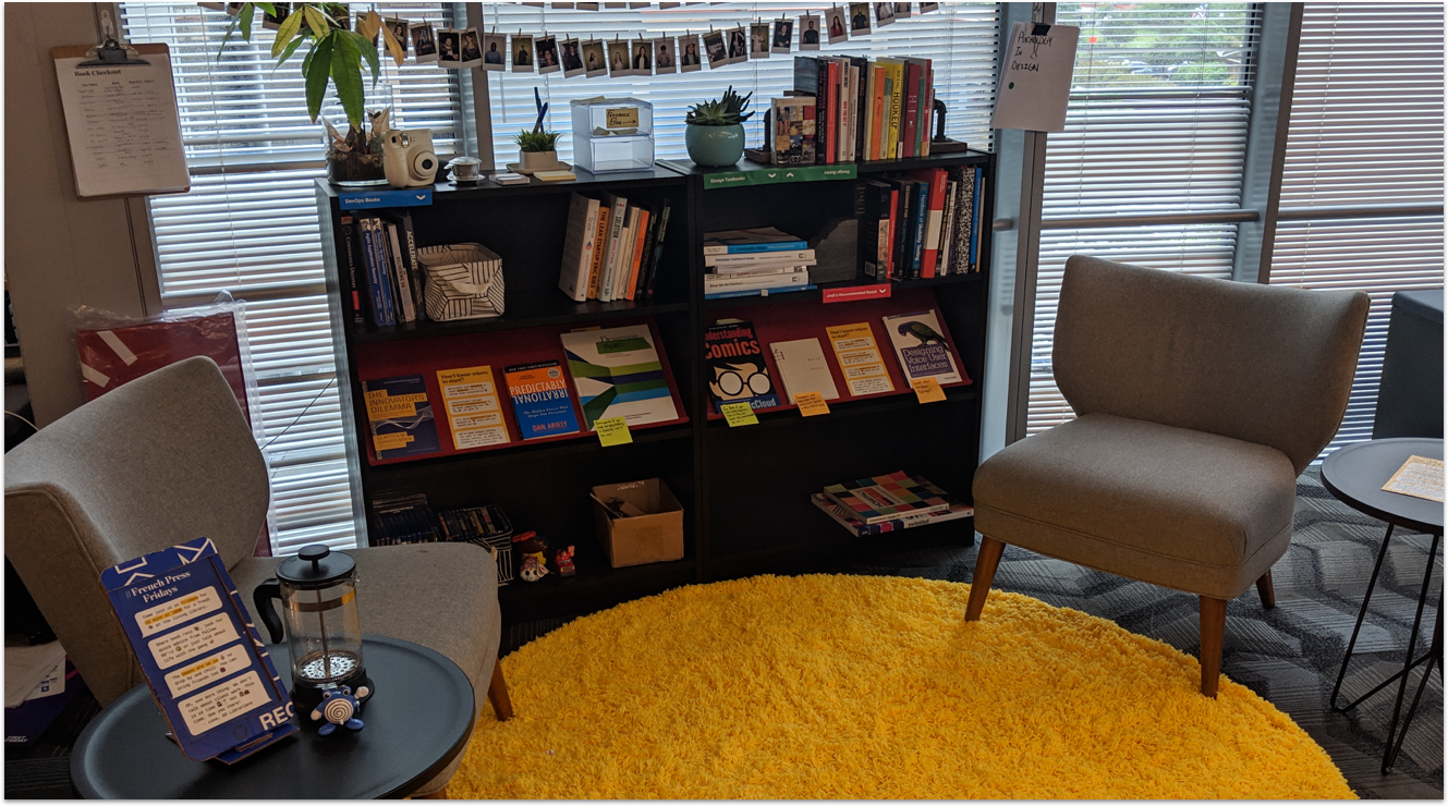
- I wrote parting notes to each of the team’s members and provided a list of recommended readings. I requested the manager to purchase a copy of Adam Silver’s “Form Design Patterns” for the team.
A kind email from a new UX ally
We really appreciate all the help and dedication you brought to our team! Especially enabling us to be more self-sufficient in designing for the user in the future.