AIGA Washington DC DC Design Week
I transformed a local celebration of design from an inaccessible brand to an accessible beyond compliant experience through culture, accessibility operations, and design system work.
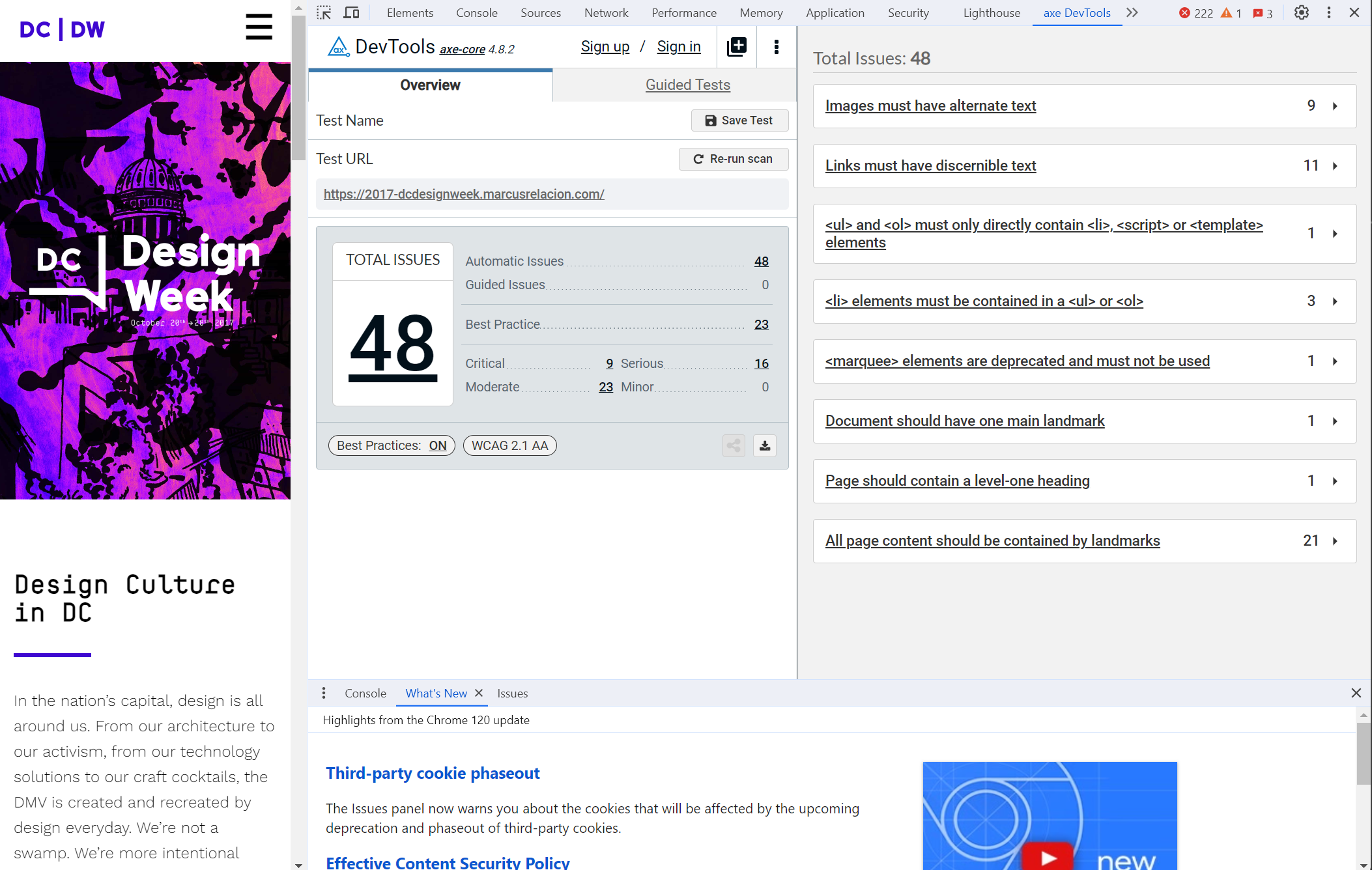
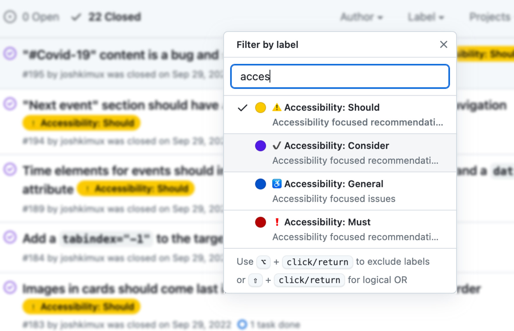
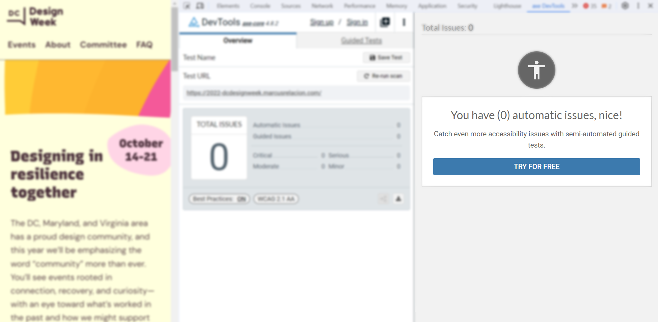
- Reduced 160+ issues caught through automated scans by 100%
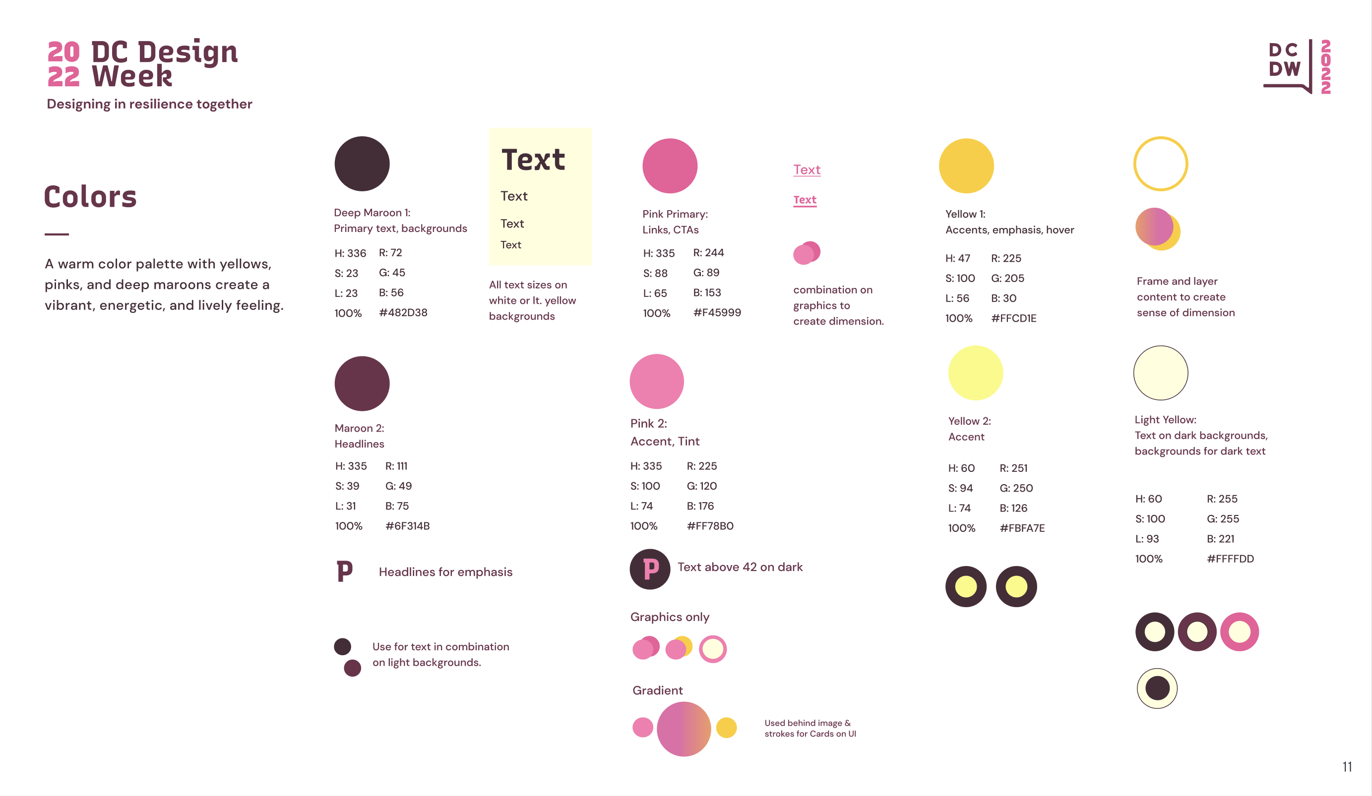
- Passed and expanded upon all WCAG 2.2 AA criteria, meeting 10+ applicable AAA criteria and prioritizing usability best practices
- Established AIGA DC's first accessibility statement, severity rubric, and accommodation request process
Challenge
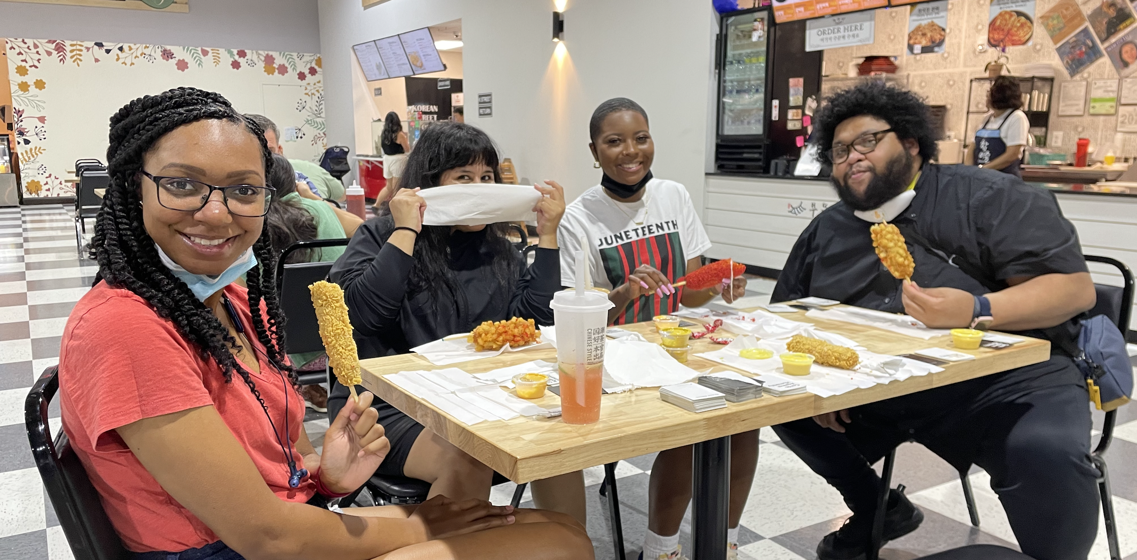
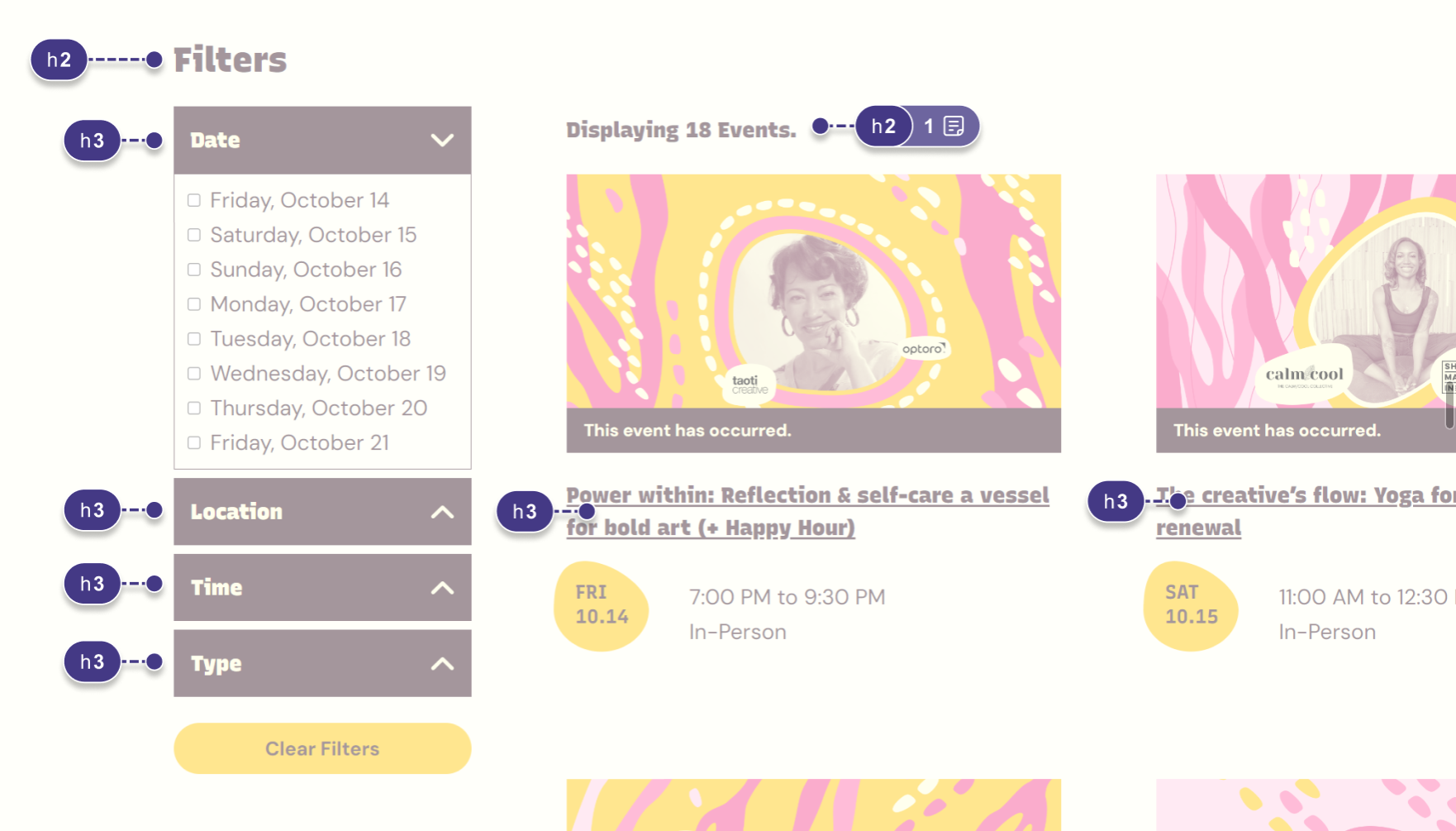
DC Design Week is a celebration of the DC, Maryland, and Virginia region’s creative community. Each year, a committee of volunteers collaborates with local designers, businesses, and organizations to host a variety of events showcasing the work, creativity, and relationships thriving in this area.
I first joined the DC Design Week team in 2020, and was impressed by their commitment to diversity– but like many other AIGA programs, their efforts towards accessibility needed some love. Notably:
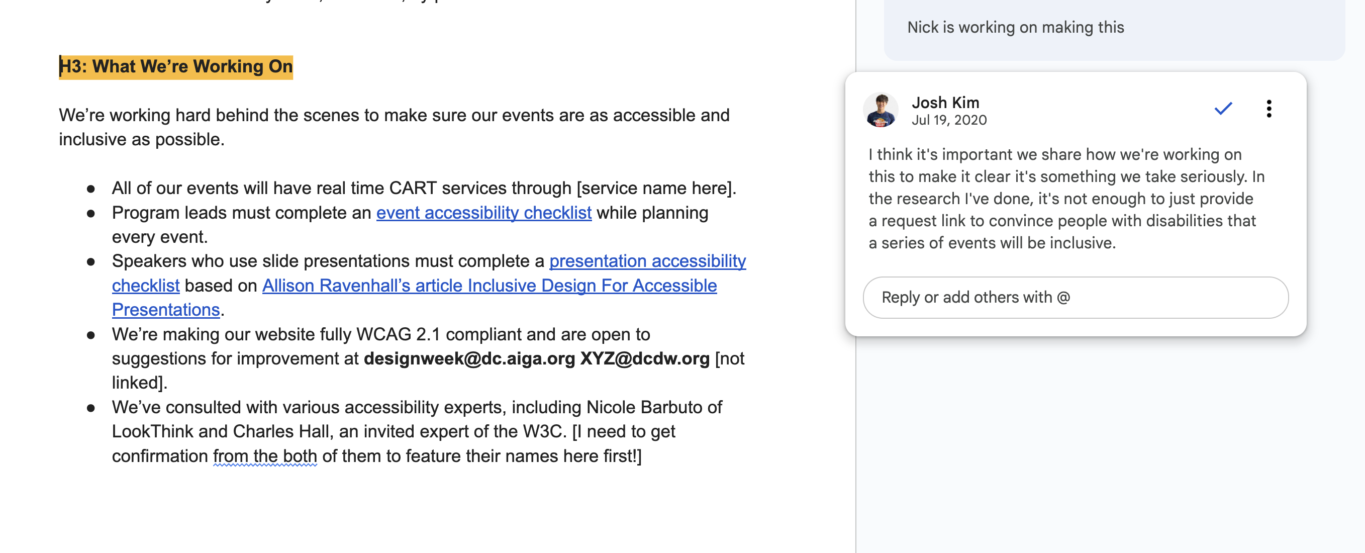
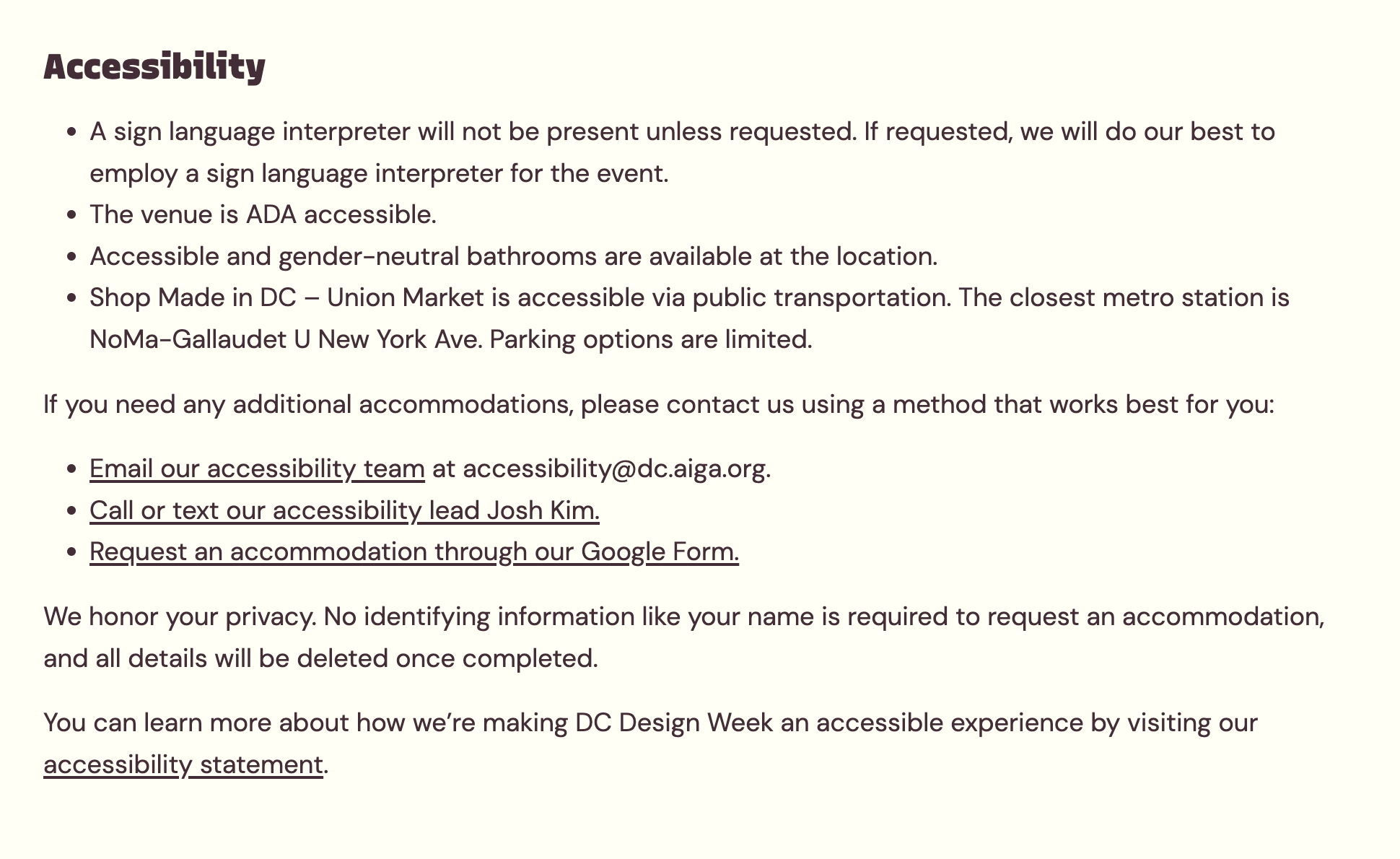
- No accessibility statement existed for the conference
- No methods existed to request for accommodations
- Branding and visual design were prioritized over accessibility
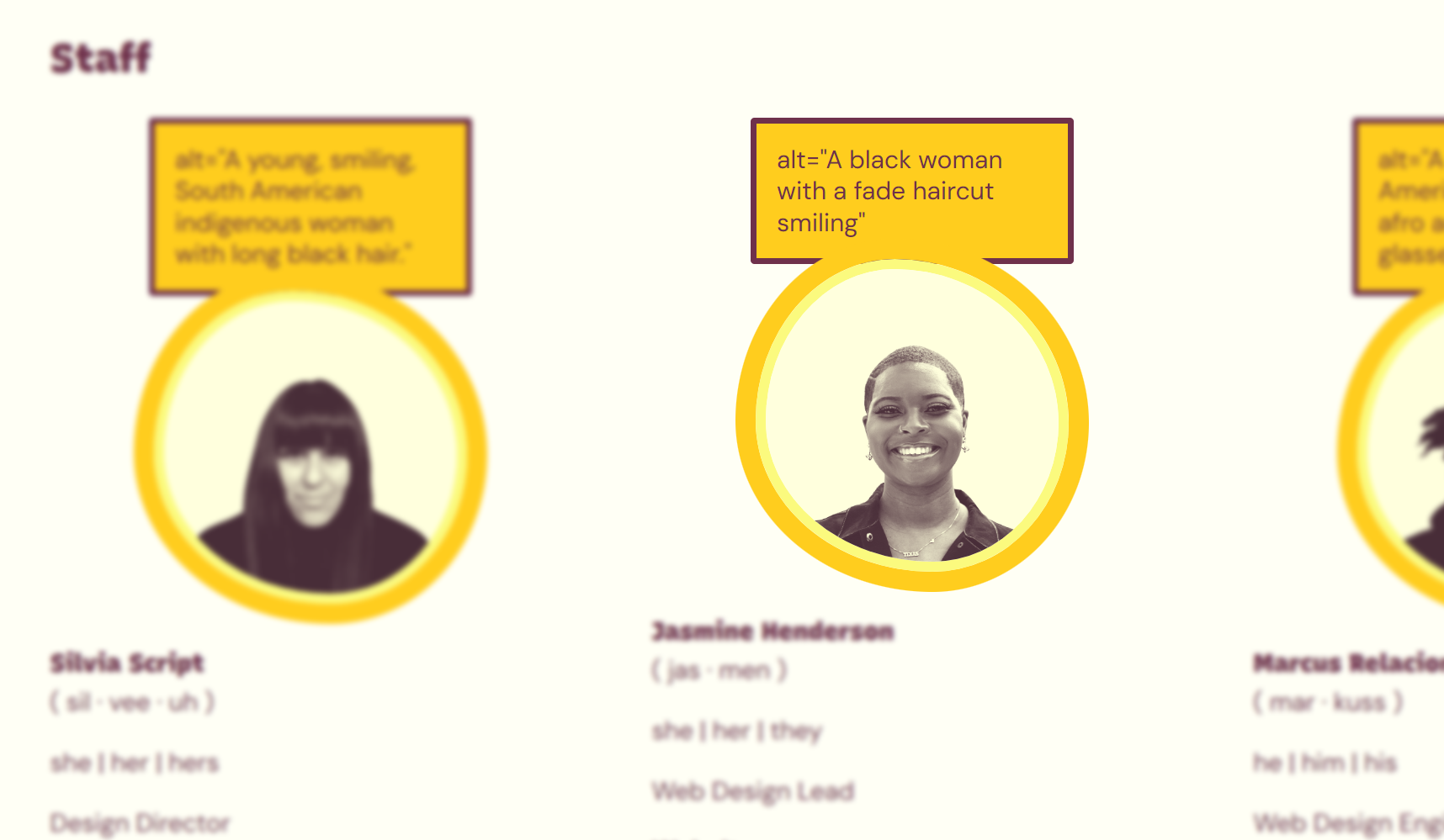
- There were 100+ accessibility issues including color contrast, headings, motion, focus, alt text, and more
I also joined too late. Accessibility was already siloed and framed around remediation as our brand and website were already in the works.
Maturing a culture of accessibility operations, not remediation
As an annual conference that is run by over 40 volunteers and usually hosts 20+ events, DC Design Week needed upstream cultural change within the community, not last minute remediations to inaccessible ticketing and events.
You cannot put the blueberries into the muffin after it is cooked. This shows that you have to think about accessibility from the beginning, not after a website is already built. Another story is about ice cream cones. If you ignore your ice cream cone it gets very messy. In the same way, you cannot ignore accessibility until the end of the project.
In the next 2 years, I focused on embedding myself as early and as often as possible with volunteers as a partner (not an expert) to bake the blueberries (accessibility) into our muffin (process).
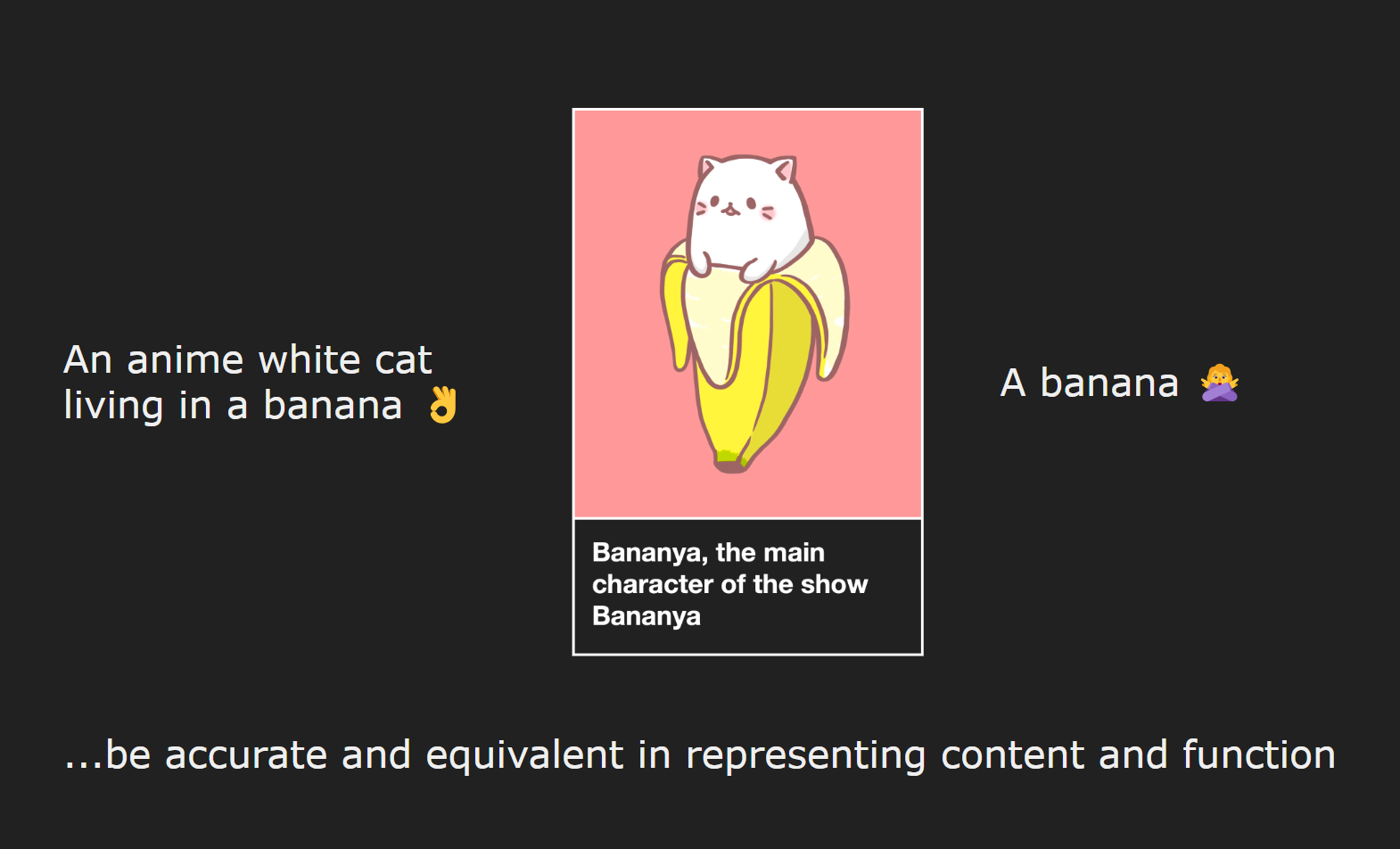
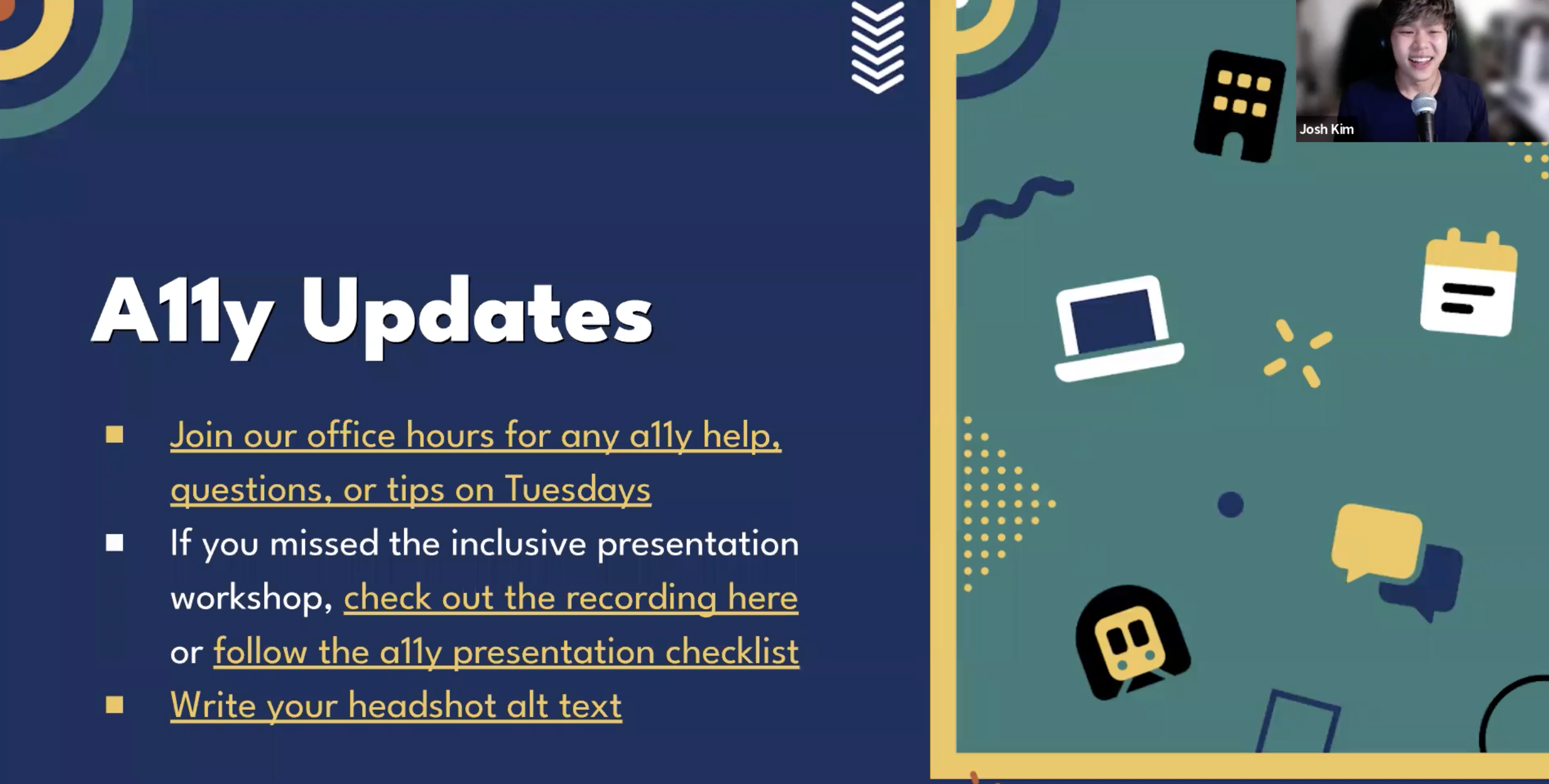
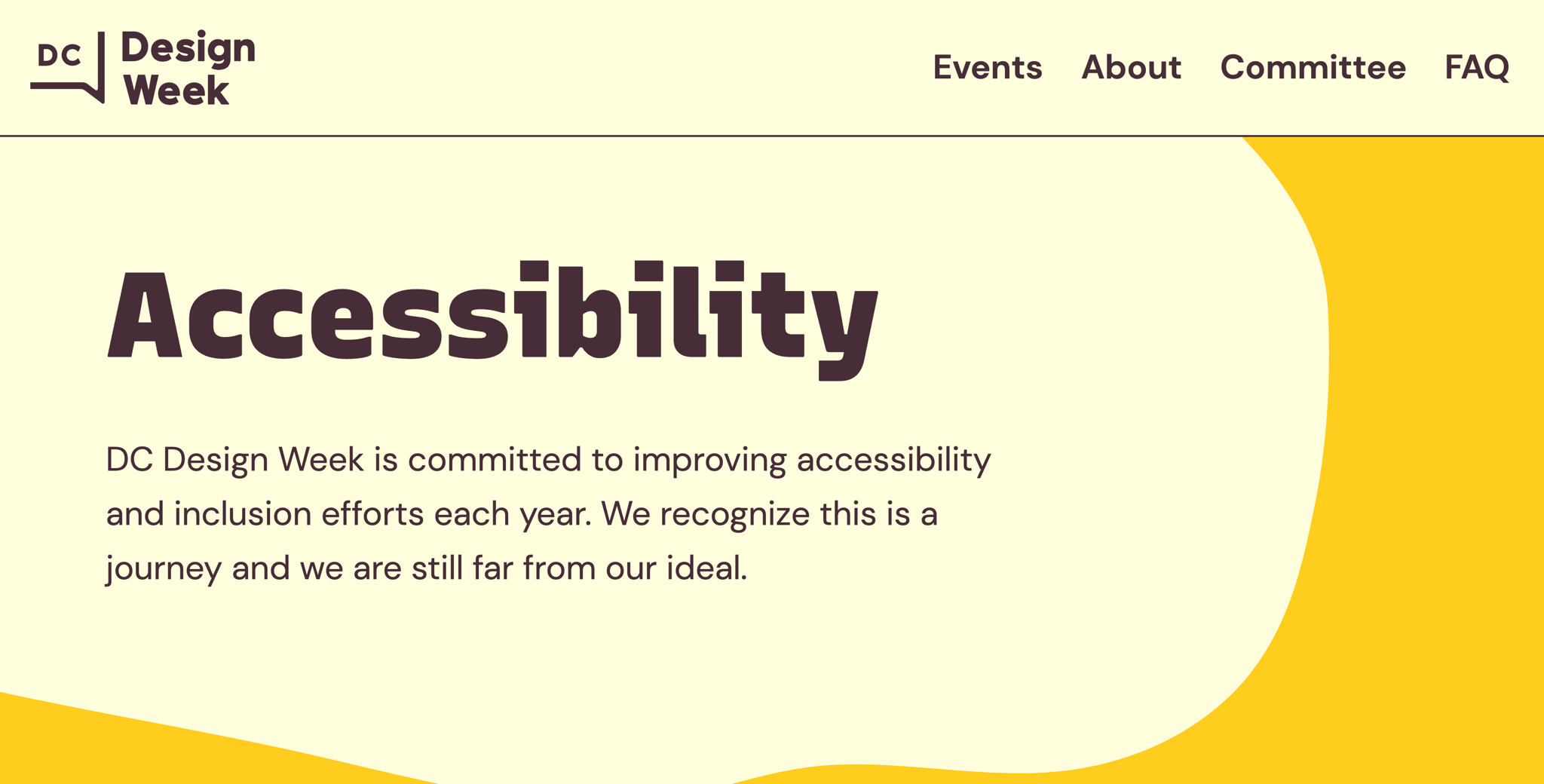
Scaling honest and inclusive content
I made it a priority to make our public content on accessibility as honest, transparent, and inclusive as possible.
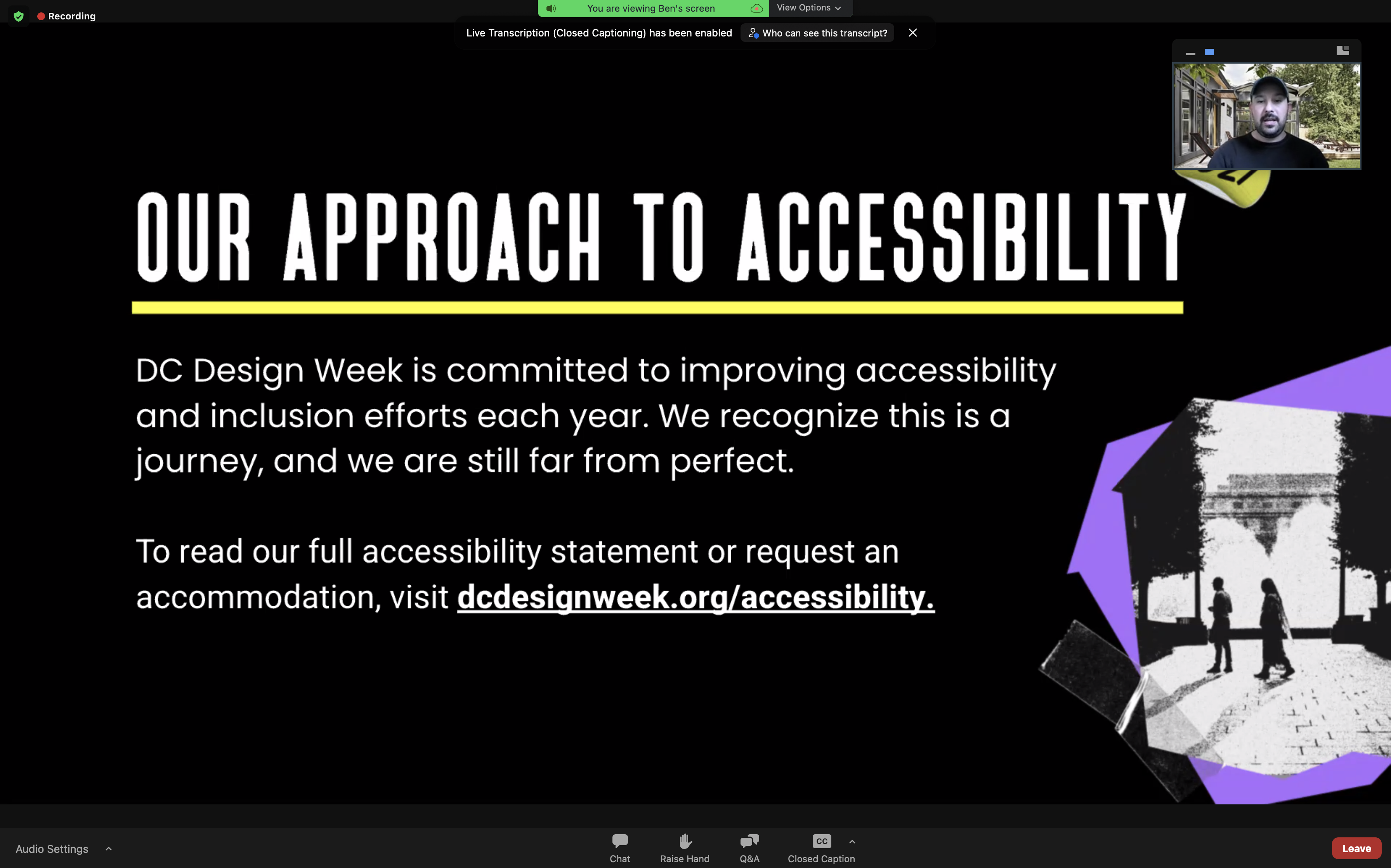
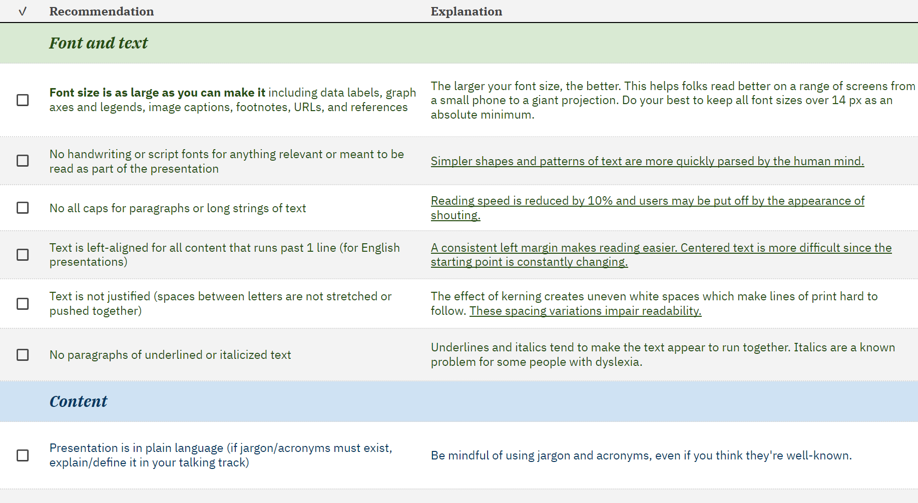
A design system that puts accessibility first
By 2022, I was able to build up a strong relationship with our design and web teams to focus on prioritizing accessibility first within our design system, code, and ultimately website.
Closing thoughts
Working with AIGA DC has been a gift over these last couple of years. While we’ve made huge leaps in accessibility as a ragtag team of volunteers, I feel we’re only just getting started:
- Issues remain to be resolved, or may not have been caught yet
- AIGA national remains to be inaccessible, with little transparency on how they plan to better include disabled creatives (if at all)
- We need to include more disabled people within our teams and collaborate closer with local disabled creative groups
Although this is my last year with the DC Design Week team, I’m confident that with good people and an accessibility-first culture, we’ll continue to reach new heights.