Community Art for Everyone Co-designing a nonprofit website
I used participatory design methods to co-design a website and brand for a new local community arts nonprofit.
Designing for Good
“Can I really say I’m designing for good at work?” I asked myself that alot two years into my job at Deloitte Digital. I joined the D.C. branch in hopes I could work on meaningful projects that could help people in need— but, two years in, I realized that the whole bottom line dilemma of big consulting wouldn’t make that so simple. Who wouldn’t feel ethically queasy over working for a company that does work with ICE?
To ease my cognitive dissonance, I decided to do a probonothon for a local nonprofit in need of a website. (I'll cover the ethical grey area of "for good" hackathon projects later in this article). I had the confidence I needed to operate solo thanks to lessons learned from a failed attempt at redesigning a cafe's website with a team, so I was eager to get started.
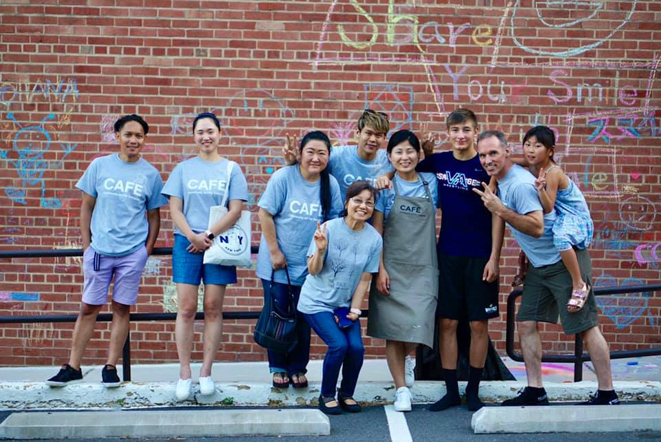
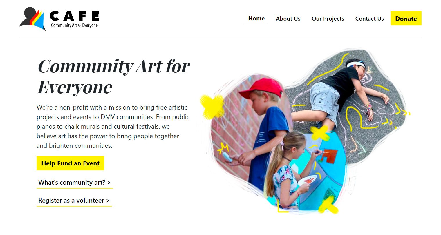
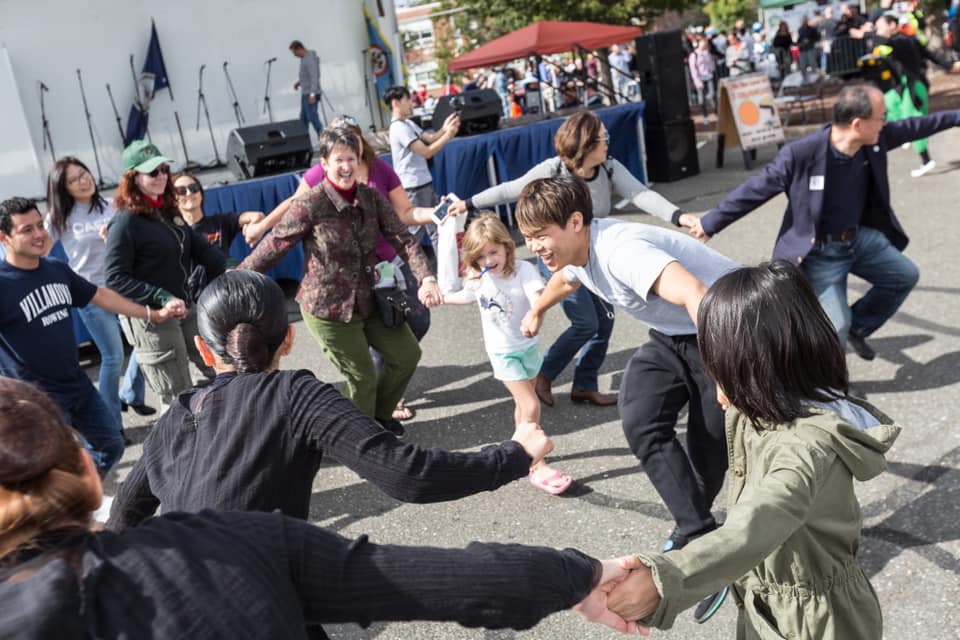
Community Art for Everyone, or CAFE, immediately caught my eye as the perfect place to start. CAFE is a local nonprofit organization that provides free community art events to disadvantaged communities. I had known the owner for a while, loved the work that was being done, and knew she was interested in creating a website and brand in hopes of expanding her efforts even more.
Planning a Probonothon
If it wasn't obvious already, a probonothon is basically the same concept of a hackathon: create something in under 24 hours-- but specifically for the purpose of helping someone else.
But first, is this ethical?
Before starting, I spent some time thinking of the ethical implications. As I mentioned earlier, there’s a big grey area when it comes to hackathons. They’re usually hosted in privileged design sites with environments that cater specifically to white and east-Asian men without disabilities.
That being said, when these hackathons are organized for the sake of designing for good, they usually produce technically brilliant design interventions that are mismatched for their intended (and often uninvolved) users and clients.
Preparing Together
To avoid the trap of creating a mismatched solution, I met with CAFE’s director ahead of time and facilitated a participatory design workshop. We worked together to map out her vision for the organization and thought about how that might manifest through a brand and website (if it was needed at all).
Once the workshop came to a close, we mutually set a date to meet again to kick off the probonothon. The goal? Create CAFE's website in a day. Why just a day?
- Post preparation, we agreed that CAFE's needs would not require a dynamic or domain-complex website.
- The director had an upcoming proposal that could be significantly enhanced with a brand and website.
- I knew I would risk either procrastination or an overbaked process if I gave myself too much time.
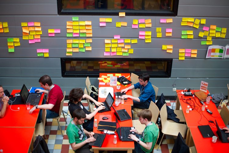
Creating a Website in 12 Hours
I wanted this probonothon to be a collaborative process, but I also didn’t want it to be a nightmare for the director. For obvious reasons, it’s unreasonable to ask anyone to work on anything for more than 8 hours.
Luckily, collaboration in this case wouldn’t have to extend out to development. I knew I could conduct the dev work alone at night provided we could co-design a decent prototype during the day.
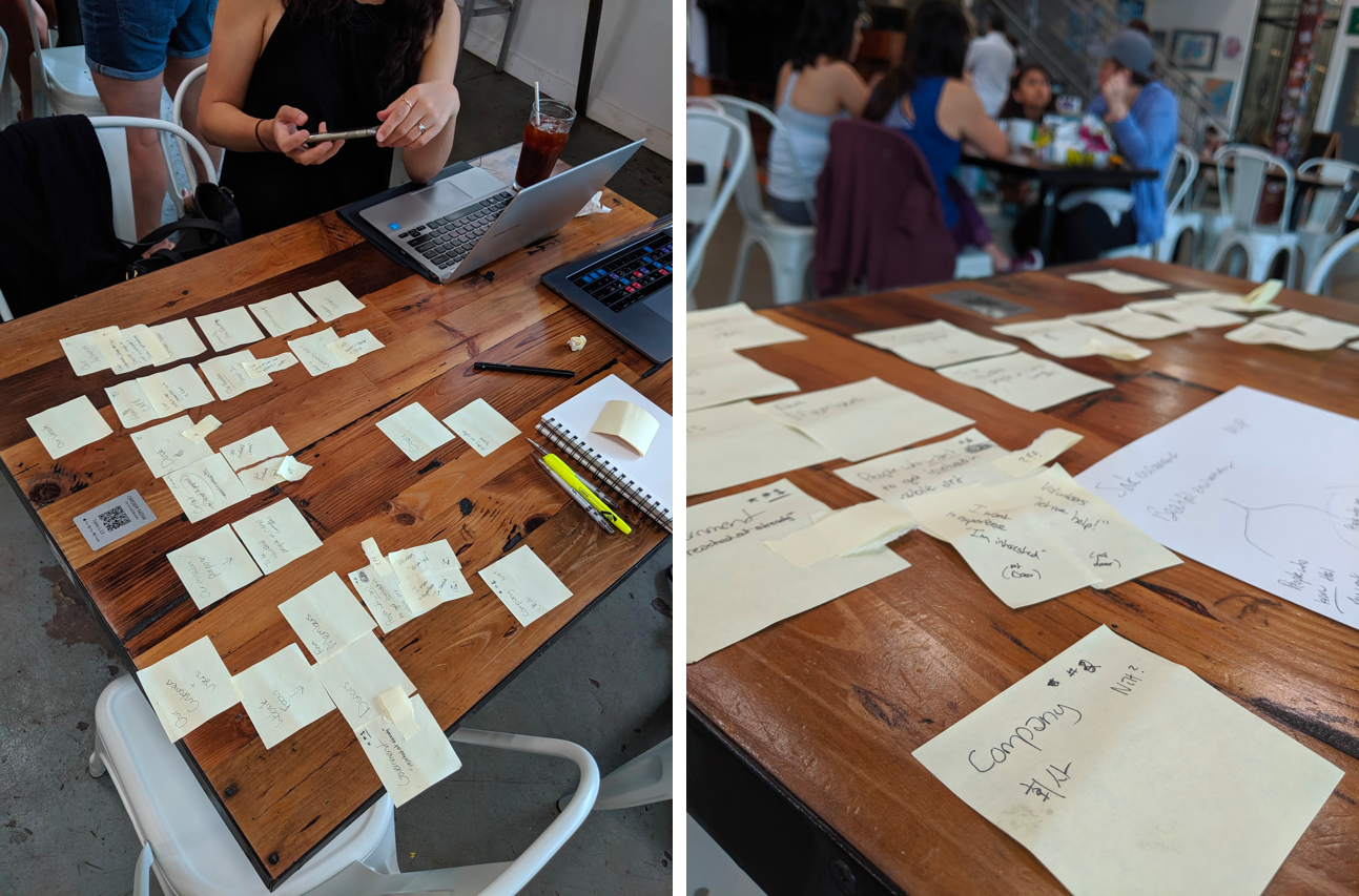
We started with lean research. I called several designers I knew who worked in the nonprofit industry while the director conducted competitive research based on nonprofits similar to CAFE. I also asked her to save the ones she liked aesthetically as a makeshift mood board.
Based off of our research, we sketched out paper components and stitched them together to form a working information architecture and low-fidelity prototype. We used customers at the coffee shop (with permission from the owner) to conduct informal usability tests which guided our iterations.
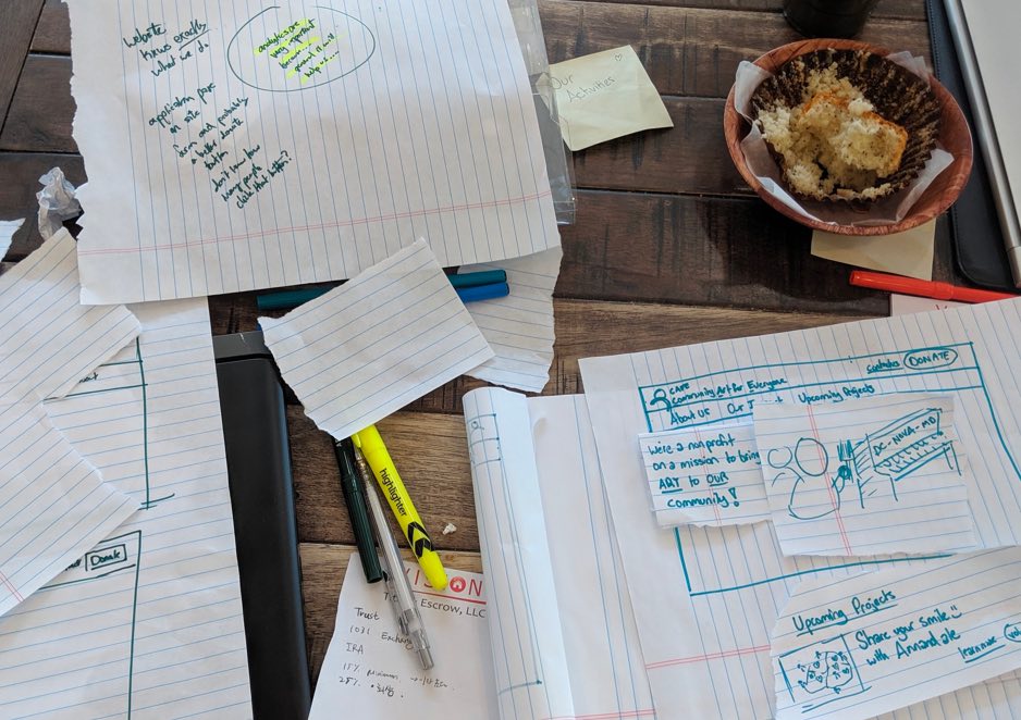
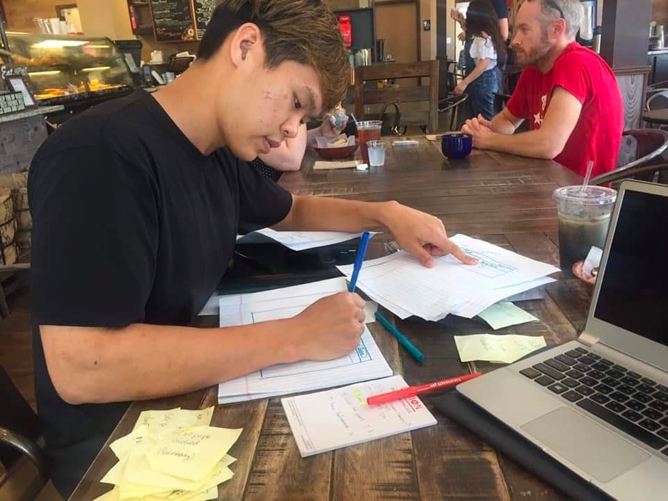
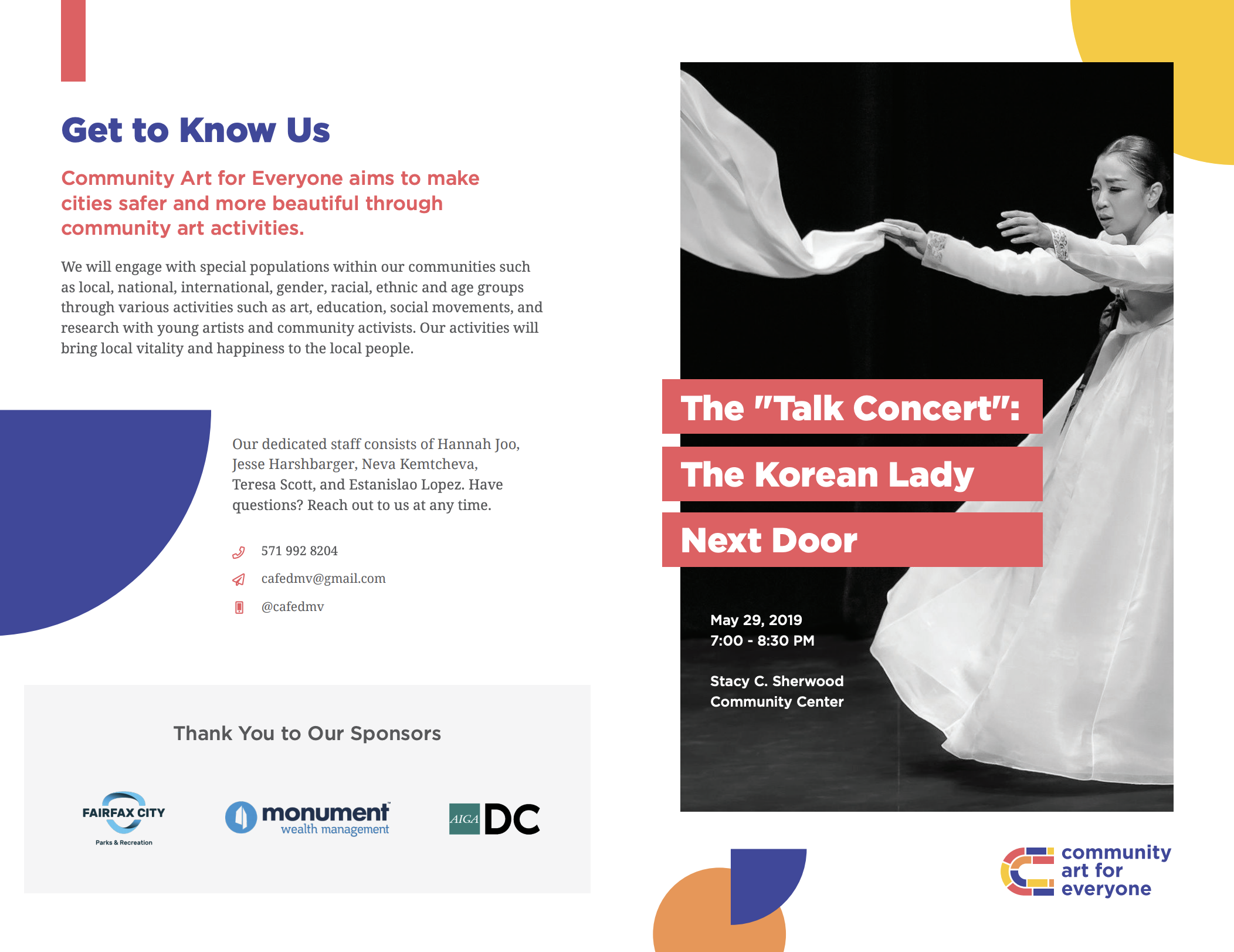
With our drawn out wireframes, I began to create a working prototype using a bootstrap template I found online that best matched the websites the director had picked earlier in the day. While I put together the landing page together, the director wrote content.
Upon completion of the landing page, we were mutually satisfied with the progress made within our daytime working session. I would handle the rest of the pages at night on my own with the content the director had written. Several hours later, the website was live.
Branding Up with AIGA D.C.
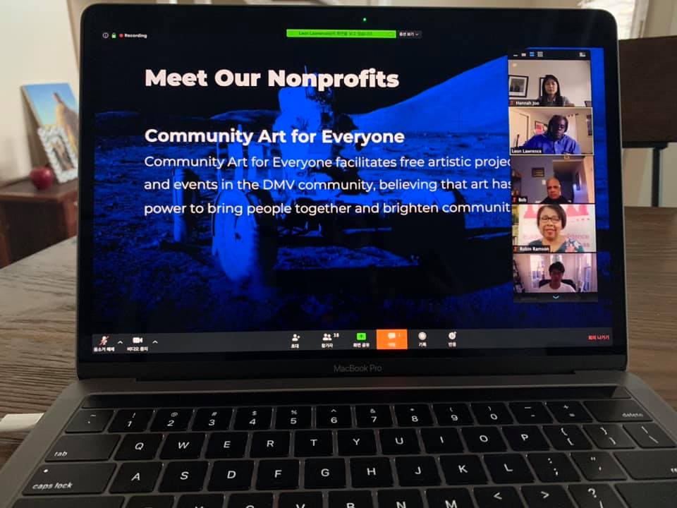
Over the course of a year, CAFE had made significant strides as a nonprofit organization with two major collaborations with the Fairfax County Parks Authority. I also made strides as a human being and found myself volunteering at more events with CAFE until I ended up joining the board.
In anticipation of bigger things in 2020 (pre-pandemic), I registered CAFE for AIGA D.C.’s annual Createathon in hopes of giving our brand a much needed refresh (no thanks to my mediocre visual design skills). We were partnered up with a team of fantastic designers led by the incredible Megan Learn and the rest was history. I’ll let their godly work do the talking.
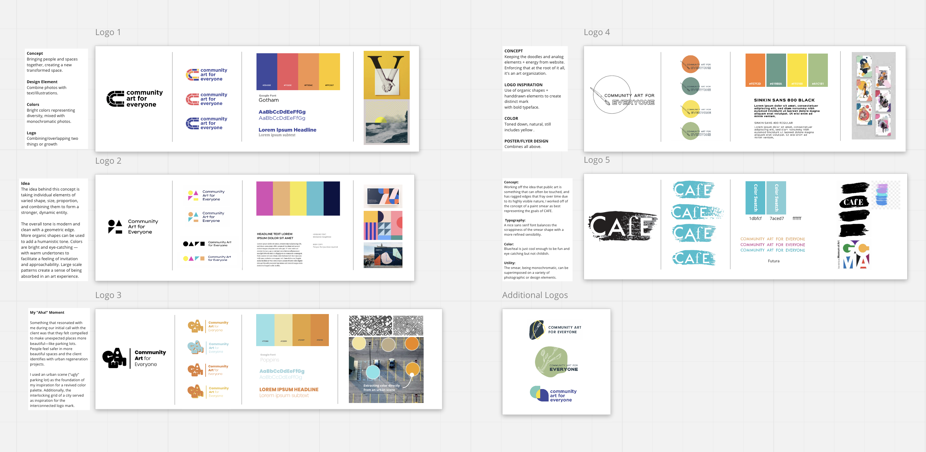
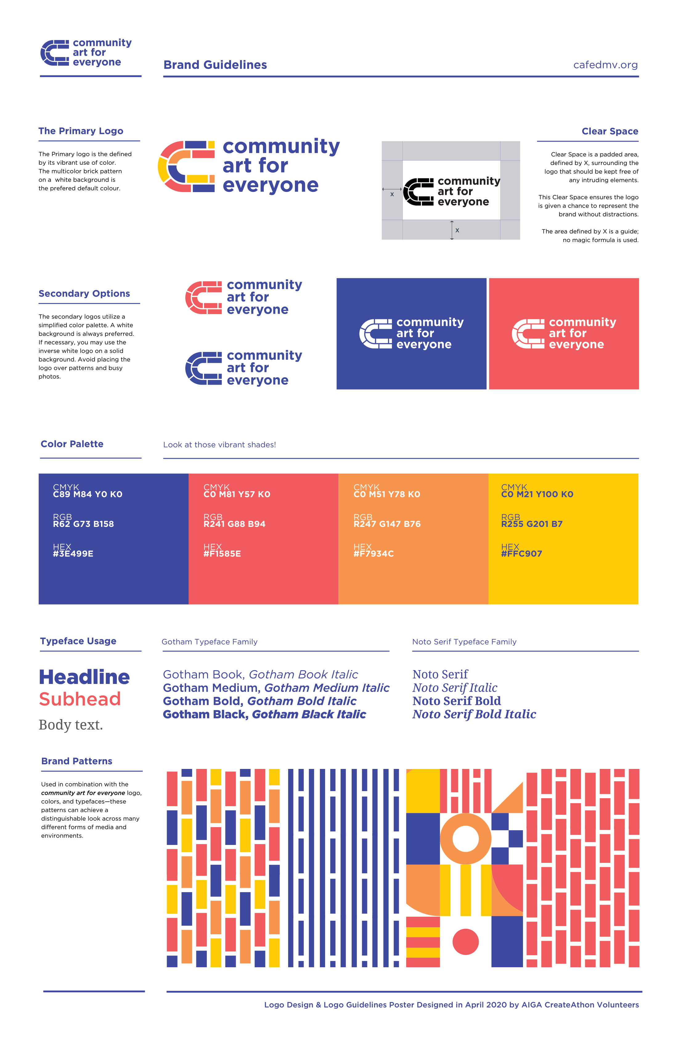
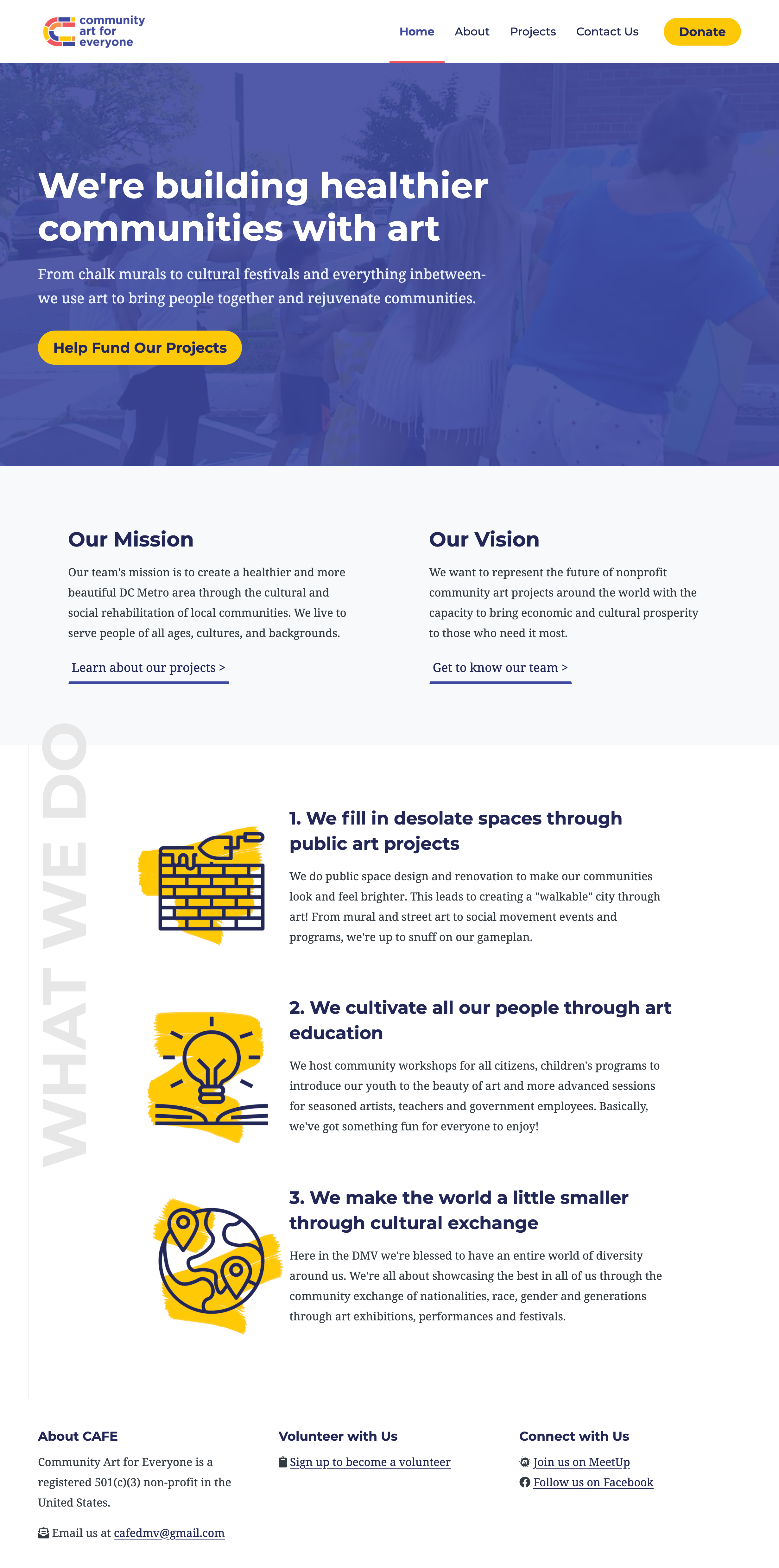
Thanks to their incredible brand guidelines, I was able to give the website a much needed update as well. I created new iconography, designed a new animated jumbotron, and jazzed up the style.
Accessibility Remediation
Some time later in 2020 I read an article from Smashing Magazine titled Designing With Reduced Motion For Motion Sensitivities. Around this time, I was studying up on my front-end skills to improve my capabilities as an inclusive designer. Needless to say, my heart dropped when I realized I had seriously fucked up with CAFE’s website (and my portfolio too).
If you’re not familiar with why this is a problem, Facundo Corradini wrote an article on his experience with animations while having a temporary vestibular disorder.
I would put the bucket beside me to good use and be forced to lie in bed for hours as I felt the room spinning around me, and no meds could get me out of it. It was THAT bad.
Beyond having triggering animations on CAFE’s website, there were a host of other accessibility defects as well due to my thoughtless decision to use an online bootstrap template. I decided to quickly remediate the more critical issues ASAP.
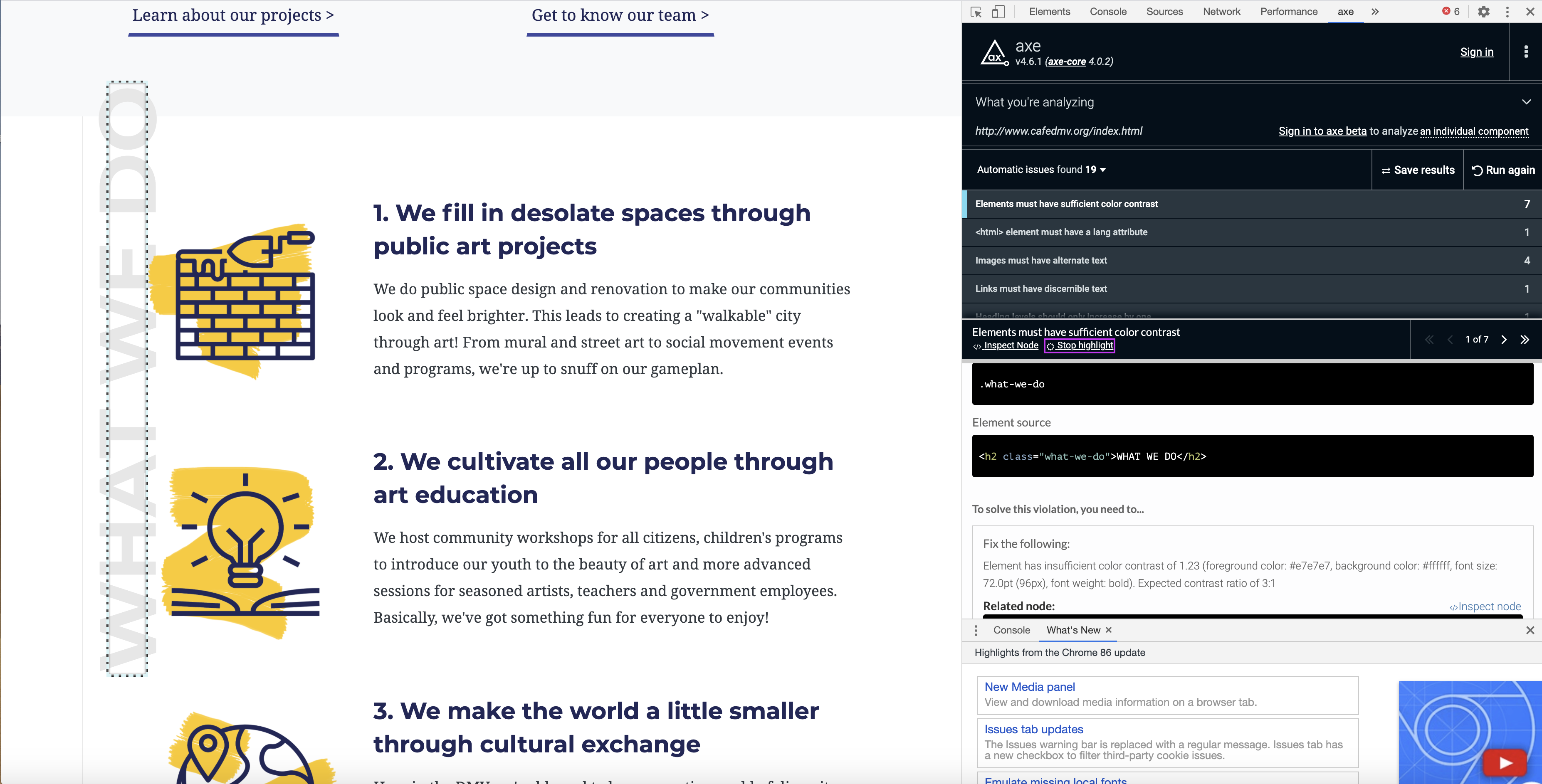
Scanning for Issues
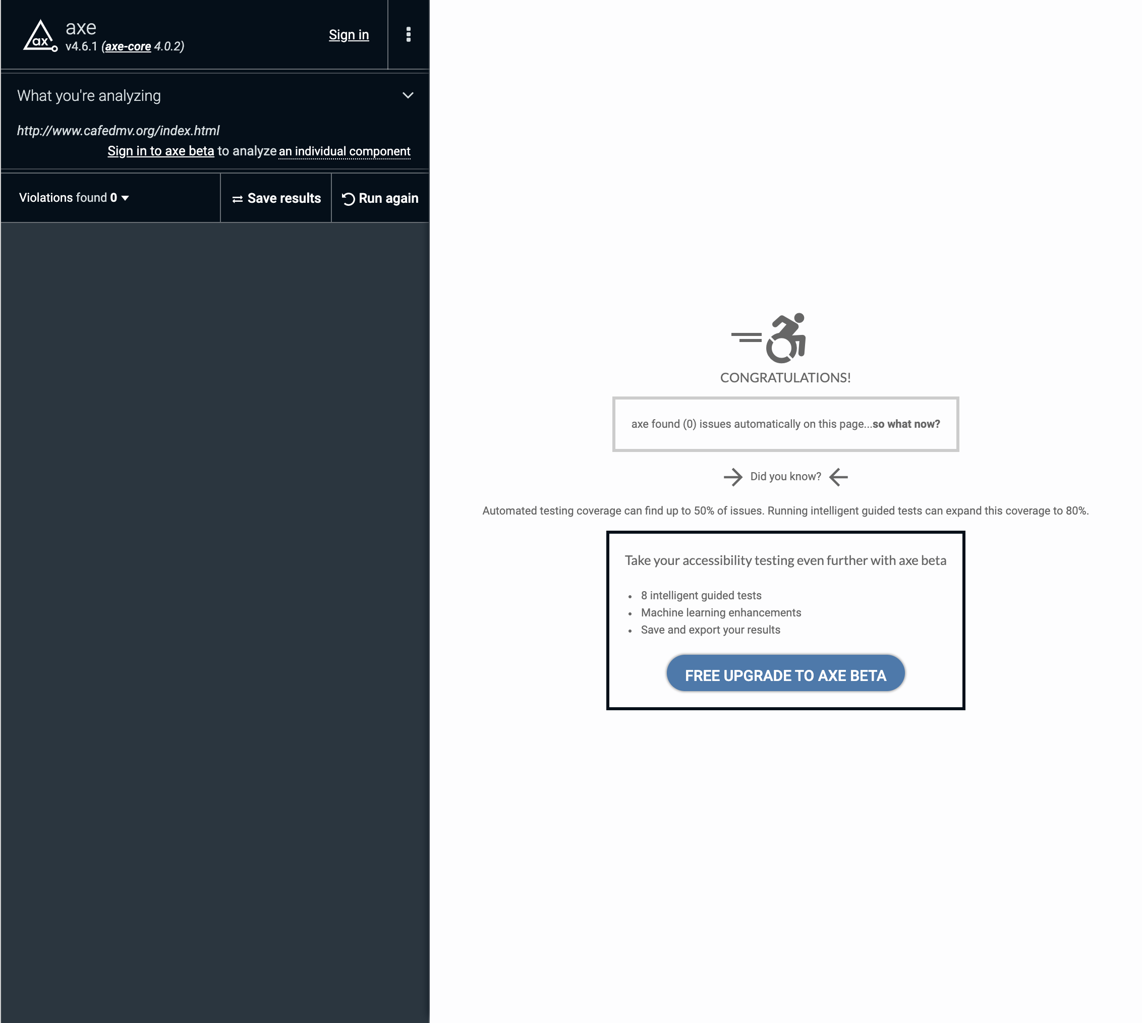
I started by running an axe scan on all the pages of the website. As anticipated, there were a ton of issues including:
- Low contrast
- Missing alt text
- Missing document language (fuck me)
- Jumped and misordered headings
I also knew that my code looked like a whole bucket of div soup. It was in desperate need of landmarks and proper HTML5 semantics.
Prioritizing Fixes
Given my limited time, I decided to prioritize the issues I would tackle. I started with reducing motion to mitigate potential harm. This was relatively straightforward thanks to Scott O’Hara’s awesome article Reduced Motion Auto-Play Video.
I then began work on improving keyboard and screen reader navigation by fixing heading levels and adding assistive technology shortcuts.
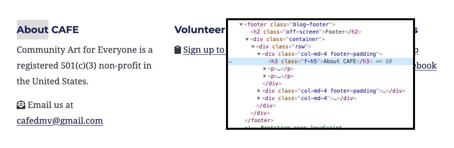
f-h5 to retain the visual appearance of an h5 while retaining the semantics of a h3. A new visually hidden h2 of "Footer" provides a buffer.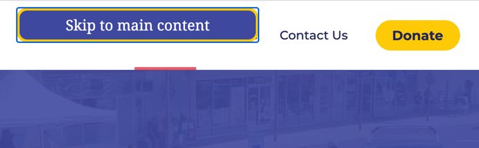
Finally, I fixed button color contrast, added a lang=“en” to the landing page, and wrote alt text for all images on the website to provide a more accessible experience.
This small effort, while meaningful, is still far from OK. In the future I'll still need to make more improvements to reduce the div soup (like using more lists).
Conclusion
Reflecting back on this pro bono work, I’ve learned a number of things which I can easily list out for anyone else interested in doing something similar:
- Think carefully about the domain of work and your own availability before you pick up a pro bono initiative. If it’s relatively simple, like CAFE, you might want to consider operating solo. Trying to recruit a team of volunteers who have real life obligations can become a nightmare deep into a project. Alternatively, consider recruiting short term volunteers for a sprint of specialty work (like branding).
- Co-design with the people you’re providing a service to. By being an open collaborator and not an expert hermit, your solution will have a better chance at being adopted and used.
- If you don’t have a lot of time and need to use a template to make a website, make sure to double check that it has been accessibly designed by running a quick axe scan or wave report. It’ll save you a whole lot of tech debt in the future.
What I can’t describe so easily in words is how meaningful this kind of work really is… if it can be considered as work at all. Over the past two years volunteering with CAFE, I’ve made precious memories and friendships that will last me a lifetime. I’ve also been motivated to volunteer more which led me to the U.S. Digital Response (which led me to my current job at Ad Hoc).
There aren’t many things more rewarding in life than giving back what you can to the world. You won’t regret it for a minute.